Finally got my GitHub account and some other useful resources for RStudio for Git, GitHub

I finally got my portfolio ready for data science and GIS specialist job searching. Many of friends in data science have suggested that having a GitHub account available would be helpful. GitHub is a site that holds and manages codes for programmers globally. GitHub works much better if your have your colleagues work on the same programming with you, it will help to track the codes editing from other people’s contribution to the programming/project.

I’ve started to host some of the codes I developed in the past on my GitHub account. I use R and Python for data analysis and data visualization; Python for mapping and GIS work. HTML, CSS and Javascript for web application development. I’ve always been curious that how other people’s readme file look much better than my own. BTW, Readme file is helping other programmer read your file and codes easier.  Some of my big data friends also share this super helpful site that teaches you how to use Git link R, R markdown with RStudio to GitHub step by step.  It’s very easy to understand.

Anyway, shot me an email to geospatialanalystyi@gmail.com if you need any other instruction on it.

github

Find out your survival rate in Titanic tragedy

I believe all of us have been watched the movie Titanic by James Cameron (1997) again and after a good sobbing, let find out if we all could survival through the Titanic. Actually, Titanic dataset is also a superstar dataset in data science that people use to do all sort of crazy survival machine learning. Today we are going to use R to answer who actually survived and what their age, sex, and social status.

The sinking of the RMS Titanic occurred on the night of 14 April through to the morning of 15 April 1912 in the north Atlantic Ocean, four days into the ship’s maiden voyage from Southampton to New York City.

titanic boat

(image from google)

  1. What is in the dataset.

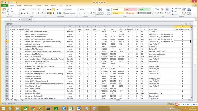
We have 1308 passengers in the data. The data includes:

survival Survival (0 = No; 1 = Yes);

pclass: Passenger Class (1 = 1st; 2 = 2nd; 3 = 3rd);

name Name;

sex Sex;

age Age;

sibsp Number of Siblings/Spouses Aboard;

parch Number of Parents/Children Aboard;

ticket Ticket Number;

fare Passenger Fare;

cabin Cabin;

embarked Port of Embarkation; (C = Cherbourg; Q = Queenstown; S = Southampton).

titanic dataset

How the dataset looks like.

2. Running R and packages.

I have uploaded my R codes to my GitHub account, find my R codes on GitHub.

3. Results.

Rplot01

This graph shows you who are on Titanic, there were more male passengers than female especially for the third class.

Rplot02

This is a graph show the survival comparison. Left graph shows people who did not survive and right graph show the survival counts (how many people survived). The death rate for third class passengers was super high :-(. Female passengers had high survival rate, especially for the first class.

Rplot03

This is also a death and survival comparison but with the age element (y-axis). From who were the survivals question you could see, the female had the highest survival rate overall, but for third class female tended to be much younger to be able to survive the tragedy. Now you know why Jack did not survive in the movie Titanic wasn’t a just tragedy itself, but it also there was the higher risk for him to lose his life in the voyage sinking.

Data visualization is very straight forward, isn’t it.  Here is a TED talk ‘The beauty of data visualization’ by David McCandless I found.  It’s really inspiring if you guys every interested in data visualization.