This is Chinese version, if you have not seen the blog (in English) yet, go here: https://developmentseed.org/blog/2018/01/11/label-maker/
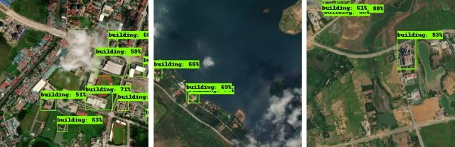
Label Maker is a python library to help in extracting insight from satellite imagery. Label Maker creates machine-learning-ready training data for most popular ML frameworks, including Keras, TensorFlow, and MXNet. It pulls data from OpenStreetMap and combines that with imagery sources like Mapbox or Digital Globe to create a single file for use in training machine learning algorithms.
# the data, shuffled and split between train and test sets
npz = np.load('data.npz')
x_train = npz['x_train']
y_train = npz['y_train']
x_test = npz['x_test']
y_test = npz['y_test']

# define your model here, example usage in Keras
model = Sequential()
# ...
model.compile(...)

# train
model.fit(x_train, y_train, batch_size=16, epochs=50)
model.evaluate(x_test, y_test, batch_size=16)
I’ve stumbled on different sorts of problems while working with geospatial data on the cloud machine. AWS EC2 and Ubuntu sometimes require different setups. This is a quick note for installing GDAL on Ubuntu and how to transfer data from your local machine to your cloud machine without using S3.
To install GDAL
sudo -i
sudo add-apt-repository -y ppa:ubuntugis/ubuntugis-unstable
sudo apt update
sudo apt upgrade # if you already have gdal 1.11 installed
sudo apt install gdal-bin python-gdal python3-gdal # if you don't have gdal 1.11 already installed
To transfer data (SFTP) from your local machine to AWS EC2, you could use FileZilla.
If you are interested in learning more about the tools, we have:
Geolambda that you can run few docker containers that provided to run geospatial analysis on the cloud;
If you are interested in applying machine learning to satellite imagery, we have a few tools: 1)Label Maker for training dataset generation; 2) looking-glass for building footprint segmentation; and 3) Pixel-Decoderfor road network detection and segmentation.
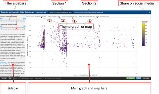
Please go ahead and play with the full-screen map here.
This map Application is developed to support the Guidelines for Sustainable Development of Natural Rubber, which led by China Chamber of Commerce of Metals, Minerals & Chemicals Importers & Exporters with supports from World Agroforestry Centre, East and Center Asia Office (ICRAF). Asia produces >90% of global natural rubber primarily in monoculture for highest yield in limited growing areas. Rubber is largely harvested by smallholders in remote, undeveloped areas with limited access to markets, imposing substantial labor and opportunity costs. Typically, rubber plantations are introduced in high productivity areas, pushed onto marginal lands by industrial crops and uses and become marginally profitable for various reasons.
Fig. 1. Rubber plantations in tropical Asia. It brings good fortune for millions of smallholder rubber farmers, but it also causes negative ecological and environmental damages.
图1:亚洲热带橡胶种植园。它给数以万计的小橡胶农民带来收入,但它也造成了负面的生态和环境的破坏。
The online map tool is developed for smallholder rubber farmers, foreign and domestic natural rubber investors as well as different level of governments.
The online map tool entitled “Sustainable and Responsible Rubber Cultivation and Investment in Asia”, and it includes two main sections: “Rubber Profits and Biodiversity Conservation” and “Risks, SocioEconomic Factors, and Historical Rubber Price”.
This graph tells the correlation between “Minimum Profitable Rubber (USD/kg)” (the x-axis of the graph, and “Biodiversity (total species number)” in 2736 county that planted natural rubber trees in eight countries in tropical Asia. There are 4312 counties in total, and in this map tool, we only present county that has the natural rubber cultivated.
Fig. 3. How to read and use the data from the first graph. Each dot/circle represents a county, the color, and size of it indicates the area of natural rubber are planted. When you move your mouse closer to the dot, you will see “(2.34, 552) 400000 ha @ Xishuangbanna, China”, 2.34 is the minimum profitable rubber price (USD/kg), 552 is the total wildlife species including amphibians, reptiles, mammals, and birds. “400000 ha” is the total area of planted natural rubber plantation from satellite images between 2010 and 2013. “@ Xishuangbanna, China” is the geolocation of the county.
Don’t be shy, please go ahead and play with the full-screen map here. The minimum profitable rubber price is the market price for national standard dry rubber products that would help you to start makes profits. For example, if the market price of natural rubber is 2.0 USD/kg in the county your rubber plantation located, but your minimum profitable rubber price is 2.5 USD/kg means you will lose money by just producing rubber products. However, if your minimum profitable rubber price is 1.5 USD/kg means you will still make about 0.5 USD/kg profit from your plantation.
The county that has a lower minimum profitable price for natural rubber is generally going to make better rubber profit in the global natural rubber market. However, as scientists behind this research, we hope that when you rush to invest and plant rubber in a certain county, please also think about other risks, e.g. biodiversity loss, topographic, tropical storm, frost as well as drought risks. They are going to be shown later in this demonstration.
Fig. 4. The first map is the “Rubber Cultivation Area”, which shows the each county that has rubber trees from low to high in colors from yellow to red. The second map “Minimum Profitable Rubber Price”(USD/kg), again the higher the minimum profitable price is the fewer rubber profits that farmers and investors are going to receive. The third map is ” Biodiversity (Amphibians, Reptiles, Mammals, and Birds)”, data was aggregated from IUCN-Redlist and BirdLife International.
We also demonstrated different types of risks that investors and smallholder farmers would face when they invest and plant rubber trees. Rubber tree doesn’t produce rubber latex before 7 years old, and the tree owners won’t make any profit until the tree is around 10 years old in general. In this section, we presented “Topographic Risk”, ” Tropical Storm”, “Drought Risk”, and “Frost Risk”.
Fig. 5. Section 2 ” Risks, SocioEconomic Factors and Historical Rubber Price” has seven different theme maps and interactive graphs. They are “Topographic Risk”, ” Tropical Storm”, “Drought Risk”, and “Frost Risk”, “Average Natural Rubber Yield (kg/ha.year)”, “Minimum Wage for the 8 Countries (USD/day)”, and ” 10 years Rubber price”.
Dr. Chuck Cannon and I are wrapping up a peer-reviewed journal article to explain the data collection, analysis, and policy recommendations based on the results, and we will share the link to the article once it’s available. Dr. Xu Jianchu and Su Yufang have shaped and provided guidance to shape the online map tool development. We could not gather the datasets and put insights to see how we could cultivate, manage, and invest in natural rubber responsibly without other scientists and researchers study and contribute to field for years. We appreciated Wildlife Conservation Society, many other NGOs and national department of rubber research in Thailand and Cambodia for their supports during our field investigation in 2015 and 2016.
The following work was done by me and Dr. Shay Strong, while I was a data engineer consultant under the supervision of Dr. Strong at OmniEarth Inc. All the work IP rights belong to OmniEarth. Dr Strong is the Chief Data Scientist at OmniEarth Inc.
After obtaining 0.4 m resolution satellite imagery of the wildfire damage in Gatlinburg and Pigeon Forge from Digital Global, OmniEarth Inc created an artificial intelligence (AI) model that was able to assess and identify the property damage due to the wildfire. This AI model will also be able to more rapidly evaluate and identify areas of damage from natural disasters from similar issues in the future.
Fig 1. The final result of fire damage range in TN from our AI model. 该图是通过人工智能模型生成的火灾受灾范围图。
1. Artificial intelligence model behind the wildfire damage火灾模型背后的人工智能
With assistance from increasing cloud computing power and a better understanding of computer vision, more and more AI technology is helping us detect information from trillions of photos we produce daily.计算机图像识别和云计算能力的提升,使得我们能够借助人工智能模型获取数以万计甚至亿计的照片地图等图片中获取有用的信息。
Before diving into the AI model behind the wildfire damage, in this case, we only want to identify the differences between fire-damaged buildings and intact buildings. We have two options: (1), we could spend hours and hours browsing through the satellite images and manually separate the damaged and intact buildings or (2) develop an AI model to automatically identify the damaged area with a tolerable error. For the first option, it would easily take a geospatial technician more than 20 hours to identify the damaged area among the 50,000 acres of satellite imagery. The second option poses a more viable and sustainable solution in that the AI model could automatically identify the damaged area/buildings less than 1 hour over the same area. This is accomplished by image classification in AI, using convolutional neural networks (CNN) specifically, because CNN works better than other neural network algorithms for object detection and recognition from images.
Artificial intelligence/neural networks are a family of machine learning models that are inspired by biological neurons of our human brain. First conceived in the 1960s, but the first breakthrough was Geoffrey Hinton’s work published in the mid-2000s. While our human eyes work like a camera seeing the ‘picture,’ our brain will process it and be able to construct the objects we see through the shape, color, and texture of the objects. The information of “seeing” and “recognition” is passing through our biological neurons from our eyes to our brain. The AI model we created works in a similar way. The imagery is passed through the artificial neural network, and objects that have been taught to the neural network are identified with certain accuracy. In this case, we taught the network to learn the difference between burnt and not-burnt structures in Gatlinburg and Pigeon Forge, TN.
2. How did we build the AI model
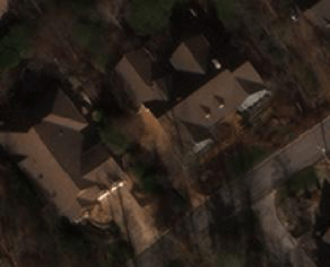
We broke down the wildfire damage mapping process into four parts (Fig 1). First, we obtained the 0.4m resolution satellite images from Digital Globe (https://www.digitalglobe.com/). We created a training and a testing dataset of 300 small images chips (as shown in Fig 3, A and B) that contained both burnt and intact buildings, 2/3 of which go to train the AI model, CNN model in this case, and 1/3 of them are for test the model. Ideally, the more training data used to represent the burnt and non-burnt structures are ideal for training the network to understand all the variations and orientations of a burnt building. The sample set of 300 is on the statistically small side, but useful for testing capability and evaluating preliminary performance.
Fig 3(A). A burnt building
Fig3(B). Intact buildings
Our AI model was a CNN model that built upon Theano (GPU backend) (http://deeplearning.net/software/theano/). Theano was created by the Machine Learning group at the University of Montreal, led by Yoshua Bengio, who is one of the pioneers behind artificial neural networks. Theano is a Python library that lets you define and evaluate mathematical expressions with vectors and matrices. As a human, you can imagine our daily decision-making is based on the matrices of perceived information as well, e.g. which car you want to buy. The AI model helps us to identify which image pixels and patterns are fundamentally different between burnt and intact buildings, similar to how people give a different weight or score to the car brand, model, and color they want to buy. Computers are great at calculating matrices, and Theano brings it to next level because it calculates multiple matrices in parallel, and so speeds up the whole calculation tremendously. Theano has no particular neural network built-in, so we use Keras on top of Theano. Keras allows us to build an AI model with a minimalist design on training layers of a neural network and run it more efficiently.
Our AI model was run on AWS EC2 with a g2.2xlarge instance type. We set the learning rate (lr) to 0.01.. A smaller learning rate will force the network to learn more slowly but may also lead to optimal classification convergence, especially in cluttered scenes where a large amount of object confusion can occur. In the end, our AI model with came out with 97% of accuracy, less than 0.3 loss over three runs within a minute, and it took less than 20 minutes to run on our 3.2G satellite images.
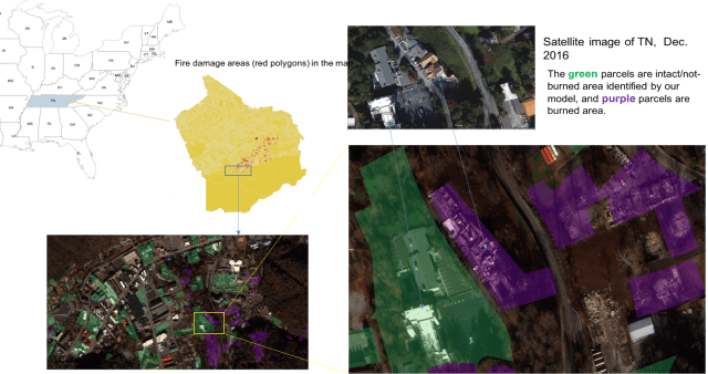
Fig 4. (A). using OmniEarth parcel level burnt and intact buildings layout on top of the imagery.
Fig 4 (B). The burnt impact (red color) on top of the Great Smoky Mountains from late Nov. to early Dec 2016.
Satellite image classification is a challenging problem that lies at the crossroads of remote sensing, computer vision, and machine learning. A lot of currently available classification approaches are not suitable to handle high-resolution imagery data with inherent high variability in geometry and collection times. However, OmniEarth is a startup company that is passionate about the business of science and scaling quantifiable solutions to meet the world’s growing need for actionable information.
Contact OmniEarth for more information:
For more detailed information, please contact Dr. Zhuangfang Yi, email: geospatialanalystyi@gmail.com; twitter: geonanayi.
or
Dr. Shay Strong, email: shay.strong@omniearthinc.com; twitter: shaybstrong.
Centers for Disease Control and Prevention (CDC) provided Zika virus epidemic from 2015 to 2016, about 107250 observed cases globally, to kaggle.com. Kaggle is a platform that data scientists compete on data cleaning, wrangling, analysis and provide the best solution for big data problems.
Zika virus epidemic problem is an interesting problem, so I took the challenge and coded an analysis in RStudio. However, after finishing a rough analysis, I found that this could be an example of big data analysis instead of a perfect example for CDC on Zika virus epidemic. Because the raw data has not been cleaned and clarified yet, and the raw data description could be seen here.
A bit of background of Zika and Zika virus epidemic from CDC.
Zika is spread mostly by the bite of an infected Aedes species mosquito (Ae. aegypti and Ae. albopictus). These mosquitoes are aggressive daytime biters. They can also bite at night.
Zika can be passed from a pregnant woman to her fetus. Infection during pregnancy can cause certain birth defects, e.g. Microcephaly. Microcephaly is a rare nervous system disorder that causes a baby’s head to be small and not fully developed.
There is no vaccine or medicine for Zika yet.
关于Zika和Zika病毒传染的一些背景知识:
Zika由通过Aedes蚊虫叮咬传播(主要是该蚊子的两个分种:Ae. aegypti 和Ae. albopictus 传播)。该蚊虫叮咬主要发生在白天,当然也会发生在晚上。
Firstly, let see the animation of the Zika virus observations globally. The cases observations were started recorded from Nov. 2015 to July 2016. At least from the documented cases during the period, it started from Mexico and El Salvador, and it spread to South American countries and the USA. The gif animation makes the data visualization looks fancy, but while I looked deeply, the dataset need a serious cleaning and wrangling.
The raw data was organized by report date, case locations, location type, data field/data category, the field code, period, its types, value (how observations/cases), the unit.
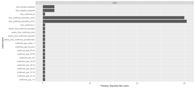
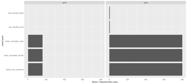
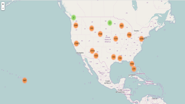
While I plotted the cases by counties from 2015 to 2016, we could see most of Zika epidemic cases were observed much more in 2016 especially in South American countries. Colombia had by far the most reported Zika cases. Puerto Rico, New York, Florida and Virgin Islands of USA have reported Zika cases so far. During this data recorded period 12 countries were reported had Zika virus cases, from most reported cases to the least these countries are: Colombia (86,889 reported cases), Dominican Republic (5,716), Brazil (4,253), USA(2,962), Mexico (2894), Argentina (2,091 ), Salvador (1,000), Ecuador(796), Guatemala (516), El Panama(148) , Nicaragua (125) and Haiti (52). See the below map.
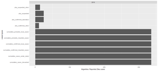
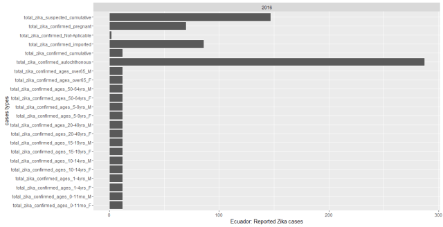
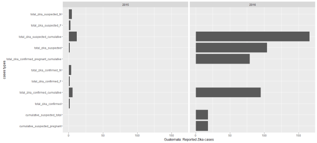
However, while I went back to organize the reported Zika cases for each country, I found the data recorded for each country was not consistent. It’s oblivious that the each country has their strengths and different constraints for tracking Zika epidemic. Let’s see some examples:
In the states, most of the reported cases are from travel. But I am confused that aren’t the confirmed fever, eye pain, headache cases overlapped with zika reported, and zika_reported travel were included in yearly_reported_travel_cases. If so, were the cases were overestimated for most of the countries. Probably only CDC could explain the data much better from medical conditions and epidemic perspective.
From the reported cases that Microcephaly cases caused by Zika virus were only founded in Brazil and Dominic Republic. Microcephaly is a rare nervous system disorder that causes a baby’s head to be small and not fully developed. The child’s brain stops growing as it should. People get infected with Zika through the bite of an infected Aedes species mosquito (Aedes aegypti and Aedes albopictus). A man with Zika can pass it to sex partners but there was a case that a woman who infected with Zika virus has been found passed the virus to her partner too.
My original R codes could be accessed here; first gif animation graph was originally coded by a UK-based data scientist Rob Harrand, and I only edit the data presented interval and image resolution.
Note: Again, this is an example of big data analysis instead of a perfect example for CDC on Zika virus epidemic, because the raw data from CDC still need seriously cleaning. For more insight, please follow CDC’s reports and cases recorded.
Photovoltaic (PV) solar panels, which convert solar energy into electricity, are one of the most attractive options for the homeowners. Studies have shown that by 2015, there are about 4.8million homeowners had installed solar panels in the United States of America. Meanwhile, the solar energy market continues growing rapidly. Indeed, the estimated cost and potential saving of solar is the most concerned question. However, there is a tremendous commercial potential for the solar energy business, and visualizing the long term tendency of the market is vital for the solar energy companies’ survival in the market . The visualization process could be realized by examining the following aspects:
Who has installed PV panels, and what are the characteristics of the household, e.g. what’s the age, household income, education level, current utility rate, race, home location, current PV resource, existing incentive and tax credits for those that have installed PV panels?
What does the pattern of solar panel installation looks like across the nation, and at what rate? Which household is the most likely to install solar panels in the future?
The expected primary output from this proposal is a web map application . It will contain two major functions. The first is the cost and returned benefit for the households according to their home geolocation. The second is interactive maps for the companies of the geolocations of their future customers and the growth trends.
Initial outputs
The cost and payback period for the PV solar installation: Why not go solar!
Incentive programs and tax credits bring down the cost of solar panel installation. This is the average costs for each state.
Going solar would save homeowners’ spending on the electricity bill.
Payback years vary from state to state, depending on incentives and costs. High cost does not necessarily mean a longer payback period because it also depends on the state’s current electricity rate and state subsidy/incentive schemes. The higher the current electricity rate, the sooner you would recoup the costs of solar panel installation. The higher the incentives from the state, the sooner you will recoup the installation cost.
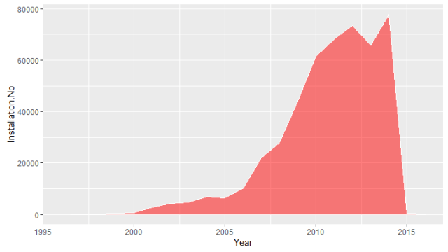
How many PV panels have been installed and where?
The number of solar panels installed in the states that have been registered on NREL’s Open PV Project. There were about 500,000 installations I was able to collect from the Open PV Project. It’s zip-code-based data, so I’ve been able to merge it to the “zip code” package on R. My R codes file is added here at my GitHub project.
Other statistical facts : American homeowners who installed solar panels generally has $25,301.5higher household income compare to the national household income. Their home located in places that have higher electricity rate, about 4 cents/kW greater than the national average, and they are also having higher solar energy resource, about 1.42 kW/m2 higher than the national average.
Two interactive maps were produced in RStudio with “leaflet”
An overview of the solar panel installation in the United States.
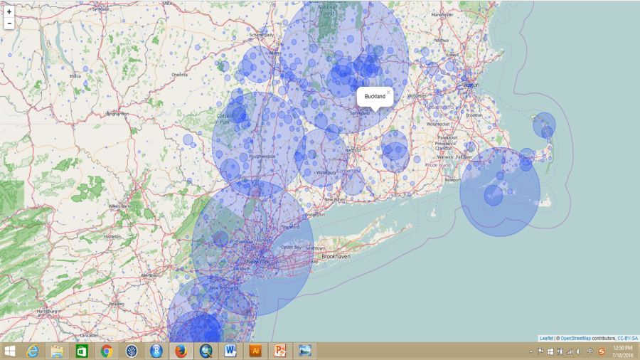
Residents on the West Coast have installed about 32,000 solar panels from the data registered on the Open PV Project, and most of them were installed by residents in California. When zoomed in closely, one could easily browse through the details of the installation locations around San Francisco.
Another good location would be The District of Columbia (Washington D.C.) area. The East Coast has less solar energy resource (kW/m2) compared to the West Coast, especially California. However, the solar panel installations of homeowners around DC area are very high too. From maps above, we know that because the cost of installation is much lower, and the payback period is much faster compared to other parts of the country. It would be fascinating to dig out more information/factors behind their installation motivation. We could zoom in too much more detailed locations for each installation on this interactive map.
However, some areas, like DC and San Francisco, have a much larger population compared to other parts of US, which means there are going to be much more installations. An installation rate per 10,000 people would be much more appropriate. Therefore, I produced another interactive map with the installation rate per 10,000 people, the bigger the size of the circle is the higher rate of the installation.
The largest installation rate in the country is in the city of Ladera Ranch, located in South Orange County, California. Though, the reason behind it is not clear and more analysis is needed.
Buckland, MA has the highest installation on the East Coast. I can’t explain what the motivation behind it yet either. Further analysis of the household characteristics would be helpful. These two interactive maps were uploaded tomy GitHub repository, where you will be able to see the R code I wrote to process the data as well.
Public Data Sources
To answer these two questions, datasets of 1670M (1.67G) were downloaded and scraped from multiple sources:
(1). Electricity rate by zip codes;
(2). A 10km resolution of solar energy resources map, in ESRI shapefile, was downloaded the National Renewable Energy Laboratory (NREL); It was later extracted by zipcode polygon downloaded from ESRI ArcGIS online.
Note: I cannot guarantee the accuracy of the analysis. My results are based on two days of data mining, wrangling, and analysis. The quality of the analysis is highly depended on the quality of the data and on how I understood the datasets in such limited time. A further validation of the analysis and datasets is needed.
I finally got my portfolio ready for data science and GIS specialist job searching. Many of friends in data science have suggested that having a GitHub account available would be helpful. GitHub is a site that holds and manages codes for programmers globally. GitHub works much better if your have your colleagues work on the same programming with you, it will help to track the codes editing from other people’s contribution to the programming/project.
I’ve started to host some of the codes I developed in the past on my GitHub account. I use R and Python for data analysis and data visualization; Python for mapping and GIS work. HTML, CSS and Javascript for web application development. I’ve always been curious that how other people’s readme file look much better than my own. BTW, Readme file is helping other programmer read your file and codes easier. Some of my big data friends also share this super helpful site that teaches you how to use Git link R, R markdown with RStudio to GitHub step by step. It’s very easy to understand.
Anyway, shot me an email to geospatialanalystyi@gmail.com if you need any other instruction on it.
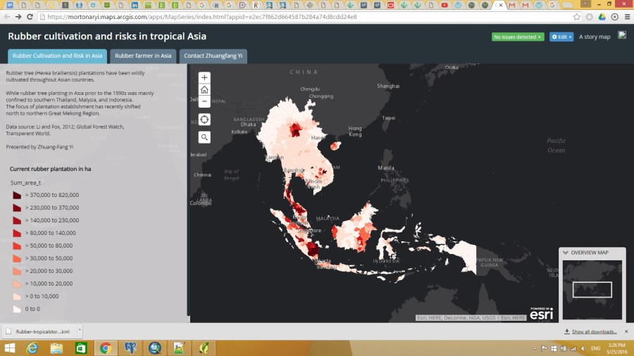
I’ve been working on a web application for Chinese Ministry of Commerce on rubber cultivation and risks will be out soon, and I just wanna share with you the simplified version web map API here. I only have layers here, though, more to come.
This web map API aims to tell the investors that rubber cultivation is not just about clearing the land/forests, plant trees and then you could wait for tapping the tree and sell the latex. There are way more risks for the planting/cultivate rubber trees, including several natural disasters, cultural and economic conflicts between the foreign investors and host countries.
We also found the minimum price for rubber latex for livelihood sustainability is as high as 3USD/kg. I define the minimum price is the price that an investor/household could cover the costs of establishing and managing their rubber plantations. While the actual rubber price is lower than the minimum price, there is no profit for having the rubber plantations. The minimum price for running a rubber plantation varies from country to country. I ran the analysis through 8 countries in Asia: China, Laos, Myanmar, Cambodia, Vietnam, Malaysia and Indonesia. The minimum price depends on the minimum wage, labour availability, costs of the plantation establishments and management, average rubber latex productivity throughout the life span of rubber trees. The cut-off price ranges from 1.2USD/kg to 3.6USD/kg.
We could make an example that if rubber price is 2USD/kg now in the market, the country whose cutoff price for rubber is 3USD/kg won’t make any profit, but the investors in the country might lose at least 1USD/kg for selling every kg of rubber latex.
I have an opportunity worked for Chinese Ministry of Commerce with ICRAF last fall, and have been studying natural rubber value chain since then. I led four technic reports on natural rubber value chain: the first report is for Thailand natural rubber value chain (please see the title);the second one is about natural rubber value chain, foreign investments and land conflicts in Cambodia; the third report is the a comparison study between Thailand and Cambodia, the biggest natural rubber producer and the emerging rubber producer; the last report will concentrate on the risks of natural rubber cultivation and investment in Asia, from geosnatially perspectives. As I mentioned in the reports that there are no winner in the natural rubber value chain: we lost biodiversity and ecosystem services from covering natural forests to rubber monoculture (upstream of the value chain); and emitted million tons of polluted air and water, and carbon dioxide back to nature from rubber processing (the midstream); at the end, without sustainable livelihood for the poor who grows rubber; and limited competitiveness in the end products market (the downstream). We should go back the source and really think about how we can improve the whole value chain, and why.
The following content is the abstract of Thailand report in English. These reports are in Chinese recently, if you are interested in the content please contact Dr. Zhuang-Fang Yi, geospatialanalystyi@gmail.com and yizhuangfang@mail.kib.ac.cn.
Figure 1. The great Mekong region and also the global nature rubber producers.
Asia supplies 93% of natural rubber demand globally. As the world No.1 natural rubber producer, Thailand has exported nearly 40% of global rubber production demands, which is 87% of its domestic rubber production. The production improvement in Thailand is not only depending on its biophysical suitability of rubber growing, but also relying on its policy supports and subsidies to millions of upstream rubber farmers. Thailand has spent about 21.3billion Baht (586million USD) from Sep. 2013 to Mar. 2014 to subsidize its rubber farmers while the price of natural rubber went down. However, lack of manufacturing and financial supports for its midstream and downstream of the natural rubber value chain, Thailand highly depends on rubber exporting to other countries, e.g. China, US, EU and Japan.
The long history of natural rubber cultivation and supports from Thai government has grown Thai rubber farmers a better rubber economic resilience cultivation systems, which is rubber agroforestry. Rubber agroforestry is a rather complex intercropping system compare to rubber monoculture. Rubber monoculture refers to the rubber plantations that only have rubber trees, and other plant species has been killed and get rids constantly by using herbicide and manual clearance. Rubber agroforestry sustains better ecosystem services and also bring more economic returns. But the labour requirement and knowledge gaps from rubber monoculture to rubber agroforestry are the main constrains for a greener cultivation system. It means rubber farmers only need to intensively take care rubber trees in rubber monoculture system, but need other knowledge and time inputs for rubber agroforestry. However, there are about 21 intercropping systems and more than 300 farms are practicing the intercropped rubber agroforestry by the rubber famers without authority supports like rubber monoculture in Thailand. Urgent research and institution support are need for rubber agroforestry in Thailand and globally.
The merging economies and natural rubber producer countries, e.g. Vietnam, Cambodia, Laos, and Myanmar in Mekong region, are following Thailand’s foot steps, only practicing rubber monoculture, that highly support its upstream value chain but lack of rubber manufacturing and supporting financing systems for mid-stream and downstream. It leads to heavily depend on Chinese and the rest of world rubber demands. It leads to very weak economic resilience for millions of smallholding rubber farmers when the price goes down. In China market, rubber price dropped from 6.3USD/kg to less than a dollar in 2014. China, as the biggest natural rubber importer, consuming nearly 40% of global rubber supply. On the other hand, 20% of imported taxes are charged and have dramatically increased the cost of rubber end products, and loss its global competitiveness in the natural rubber market. There are no winner in the natural rubber value chain: we lost biodiversity and ecosystem services from covering natural forests to rubber monoculture (upstream of the value chain); and emitted million tons of polluted air and water, and carbon dioxide back to nature from rubber processing (the midstream); at the end, without sustainable livelihood for the poor who grows rubber; and limited competitiveness in the end products market (the downstream). We should go back the source and really think about how we can improve the whole value chain, and why.
While more and more Chinese state-owned and private enterprises follow “Go Global” strategy by Chine central government who have heavily invested outside of China. Natural rubber end products, especially tires industry is one of them. In this reports, we scrutinized the natural rubber value chain in Thailand and its foreign investments , especially Chinese investments. We tried to answer:
If there are the best rubber cultivation systems that combine economic returns and a better ecosystem services supporting system;
The relationship between Chinese investors and Thai natural rubber value chain;
The possible ways of sustainable and responsible rubber cultivation and investment.
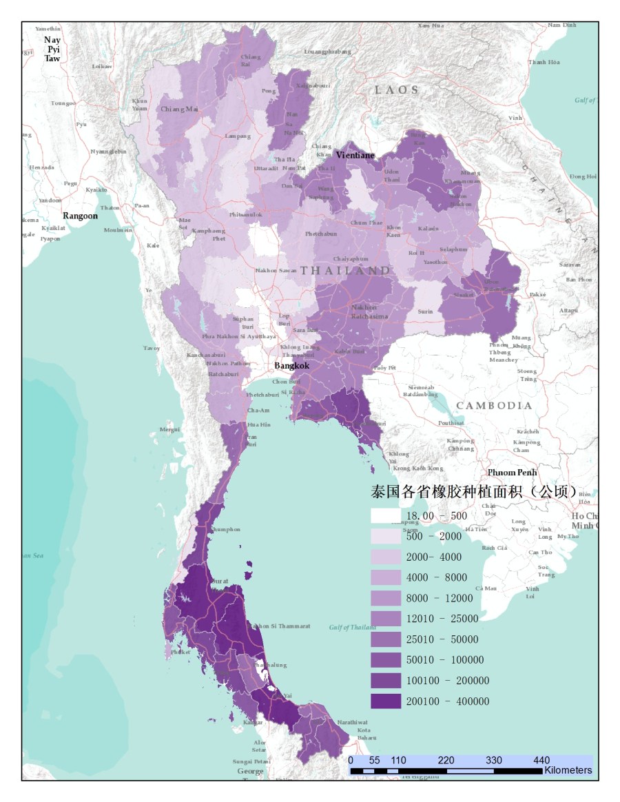
Figure 2. Thailand as the biggest rubber producer, produce 4.5millions ton of natural rubber, and 80% of Thailand domestic natural rubber is from Southern Thailand. Each polygon represents of a province in the map and the darker of the color represents the bigger area of rubber cultivation.
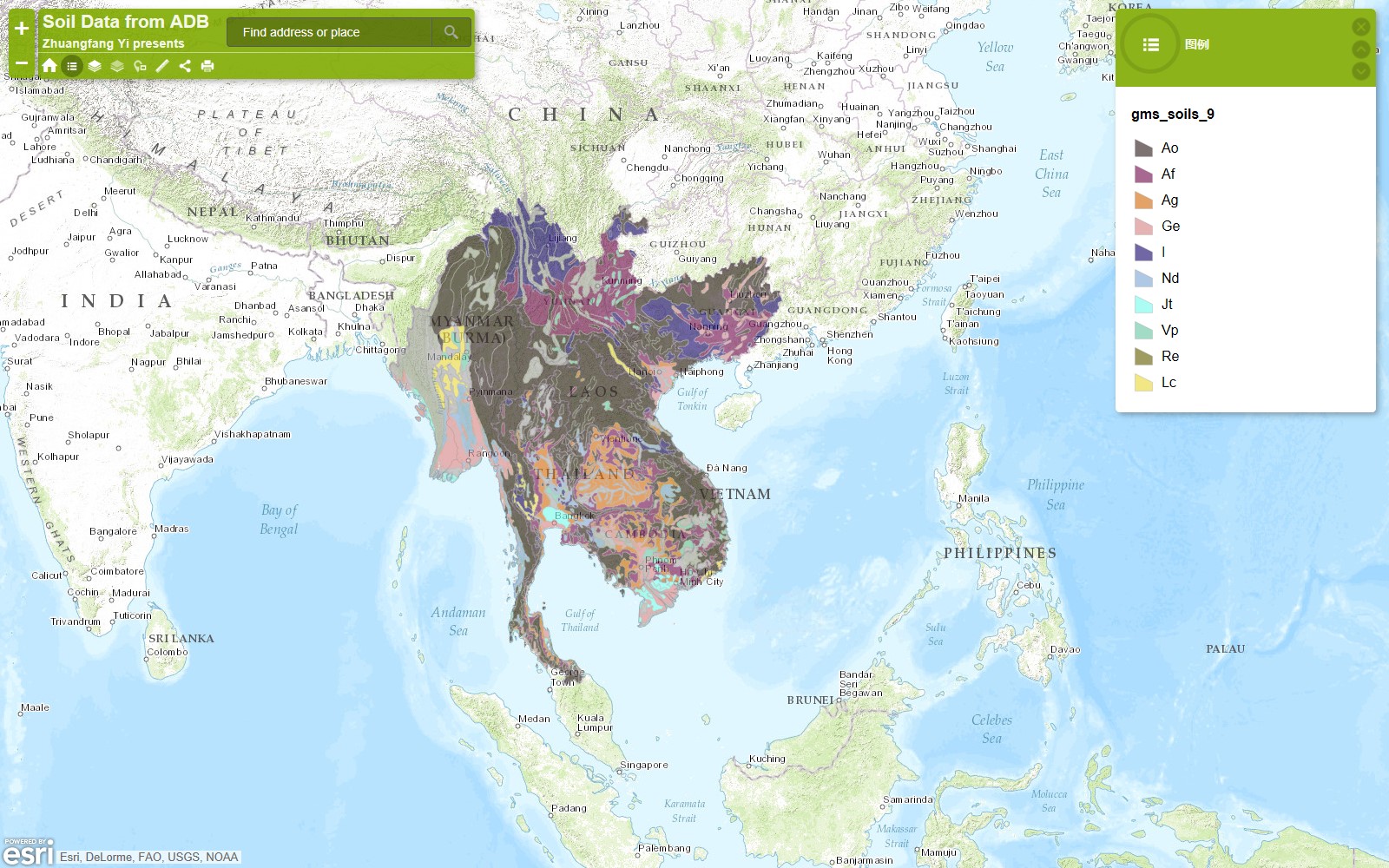
My growing interests to Mekong area have also grown my spatial data collection in the area. Just some random stuffs, and you probably knew I love open source data, and really love to visualize the date. If you guys are interested in collaboration on geospatial data analysis, data visualization on research, writing, mapping, just let me know.
These are free datasets I collected and am also trying to digitize more data for the region. These are not for commercial use, if you are interested in using in research, conservation purpose. I would love to make my contribution to visualize the data.
All the data and maps present here are used analysis and cartography tool on ArcGIS desktop, ArcGIS Online and QGIS.