How to use the online map tool for investing in sustainable rubber cultivation in tropical Asia如何利用在线地图工具投资热带亚洲可持续天然橡胶种植

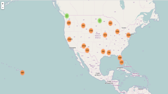
Please go ahead and play with the full-screen map here.

This map Application is developed to support the Guidelines for Sustainable Development of Natural Rubber, which led by China Chamber of Commerce of Metals, Minerals & Chemicals Importers & Exporters with supports from World Agroforestry Centre, East and Center Asia Office (ICRAF). Asia produces >90% of global natural rubber primarily in monoculture for highest yield in limited growing areas. Rubber is largely harvested by smallholders in remote, undeveloped areas with limited access to markets, imposing substantial labor and opportunity costs. Typically, rubber plantations are introduced in high productivity areas, pushed onto marginal lands by industrial crops and uses and become marginally profitable for various reasons.

请在这里播放全屏地图

这个应用地图集的开发是为了支持由中国五矿化工进出口商会和世界农用林业中心等部门联合编制的《可持续天然橡胶指南》。亚洲天然橡胶的产量占全球的90%,且主要是在有限的种植地区内,通过单一的种植,达到最高的产量。橡胶主要是由小农户在偏远的、欠发达的、市场有限的地区通过利用大量的劳动力和机会成本获得的。一般来说,橡胶只应该种植在高产量的地区,但已经被工业化的发展推到了在边缘土地上种植,并因种种原因已经边缘到无利可图。

Rubberplantation

Fig. 1. Rubber plantations in tropical Asia. It brings good fortune for millions of smallholder rubber farmers, but it also causes negative ecological and environmental damages.

图1:亚洲热带橡胶种植园。它给数以万计的小橡胶农民带来收入,但它也造成了负面的生态和环境的破坏。

The online map tool is developed for smallholder rubber farmers, foreign and domestic natural rubber investors as well as different level of governments.  

The online map tool entitled “Sustainable and Responsible Rubber Cultivation and Investment in Asia”, and it includes two main sections: “Rubber Profits and Biodiversity Conservation” and “Risks, SocioEconomic Factors, and Historical Rubber Price”.

该在线地图工具开发是为了小胶农、国内外天然橡胶投资者以及政府层面的政府使用。

这个标题为“亚洲可持续和负责任的天然橡胶种植和投资”的在线地图工具,包括两个主要部分:“橡胶利润和生物多样性保护”和“风险、社会经济因素和历史橡胶价格”。

The main user interface looks like the graph (Fig 2). There are 4 theme graphs and maps.

主用户界面看起来像图表(见图2)。有4个主题图和地图。

p1_section intro

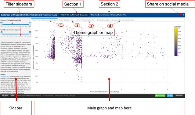
Fig. 2. The main user interface of the online map tool.

图2:在线地图工具的主要用户界面。包括上图可见的“简介”,“第一部分”,“第二部分”,和“社交媒体分享”。

. Section 1 第一部分内容

This graph tells the correlation between “Minimum Profitable Rubber (USD/kg)” (the x-axis of the graph, and “Biodiversity (total species number)” in 2736 county that planted natural rubber trees in eight countries in tropical Asia.  There are 4312 counties in total, and in this map tool, we only present county that has the natural rubber cultivated.

这张图显示了亚洲热带地区八个国家种植天然橡胶树的2736个县的最低橡胶成本(美元/千克)(图的X轴)和生物多样性(总种数)之间的关系。共有4312个县,在这个地图工具中,我们只提供了有天然橡胶种植的2736县相关的内容。

p1_section intro_high

Fig. 3. How to read and use the data from the first graph. Each dot/circle represents a county, the color, and size of it indicates the area of natural rubber are planted. When you move your mouse closer to the dot, you will see “(2.34, 552) 400000 ha @ Xishuangbanna, China”, 2.34 is the minimum profitable rubber price (USD/kg), 552 is the total wildlife species including amphibians, reptiles, mammals, and birds.  “400000 ha” is the total area of planted natural rubber plantation from satellite images between 2010 and 2013. “@ Xishuangbanna, China” is the geolocation of the county. 

图3:如何阅读和使用第一个图中的数据。每个圆点/圆代表一个县,其颜色和大小表示天然橡胶种植面积。当你移动你的鼠标时,比如你会看到“(2.34,552)400000公顷的“西双版纳、中国”,2.34是最低盈利(成本)橡胶价格(美元/公斤),552是总的野生物种,包括两栖动物、爬行动物、哺乳动物和鸟类。“400000公顷”是2010~2013年间卫星影像种植天然橡胶种植园的总面积。“西双版纳、中国”是本县的地理位置。

Don’t be shy, please go ahead and play with the full-screen map here. The minimum profitable rubber price is the market price for national standard dry rubber products that would help you to start makes profits. For example, if the market price of natural rubber is 2.0 USD/kg in the county your rubber plantation located, but your minimum profitable rubber price is 2.5 USD/kg means you will lose money by just producing rubber products. However, if your minimum profitable rubber price is 1.5 USD/kg means you will still make about 0.5 USD/kg profit from your plantation.

请不要拘谨,可以在这里浏览全屏地图。最低橡胶成本换算成国家标准的干橡胶产品的市场价格,这将有助于你理解您所属橡胶园的盈利起始点。例如,如果你所在的橡胶种植区的天然橡胶市场价格是2美元/公斤,但你的最低成本橡胶价格是2.5美元/公斤,意味着你生产橡胶产品就会亏本。然而,如果你的最低成本的橡胶价格是1.5美元/公斤意味着你的种植园仍然会赚约0.5美元/公斤的利润。

The county that has a lower minimum profitable price for natural rubber is generally going to make better rubber profit in the global natural rubber market. However, as scientists behind this research, we hope that when you rush to invest and plant rubber in a certain county, please also think about other risks, e.g. biodiversity loss, topographic, tropical storm, frost as well as drought risks. They are going to be shown later in this demonstration. 

那些天然橡胶经营平均成本最低的县,在全球天然橡胶市场上将获得较好的橡胶利润。然而,作为这项研究背后的科学家,我们希望,当你在某个县匆忙投资成本较低的县市种植橡胶时,也要考虑其他风险,例如生物多样性丧失、地形、热带风暴、霜冻以及干旱风险。这些将被显示在这个演示之后。

p2_section intro_high.gif

Fig. 4.  The first map is the “Rubber Cultivation Area”, which shows the each county that has rubber trees from low to high in colors from yellow to red. The second map “Minimum Profitable Rubber Price”(USD/kg), again the higher the minimum profitable price is the fewer rubber profits that farmers and investors are going to receive. The third map is ” Biodiversity (Amphibians, Reptiles, Mammals, and Birds)”,  data was aggregated from IUCN-Redlist and BirdLife International.

图4:第一张地图是“橡胶种植区”,它显示了每个县的橡胶树种植数量从低到高的颜色,即从黄色到红色。第二张图“最低成本”(美元/千克),橡胶的平均成本越高,橡胶园的经营者就会获得更少的利润。第三地图是“生物多样性(两栖动物、爬行动物、哺乳动物和鸟类)”,数据来自世界自然保护联盟红色名录IUCN-Redlist和国际鸟盟聚集BirdLife International

. Section 2 第二部分

We also demonstrated different types of risks that investors and smallholder farmers would face when they invest and plant rubber trees. Rubber tree doesn’t produce rubber latex before 7 years old, and the tree owners won’t make any profit until the tree is around 10 years old in general. In this section, we presented “Topographic Risk”, ” Tropical Storm”, “Drought Risk”,  and “Frost Risk”.

我们还展示了投资者和小农投资种植橡胶树时会面临的不同风险类型。橡胶树种植前7年在橡胶树不生产任何胶乳的情况下是没有任何盈利的,甚至橡胶园的经营者一般在橡胶树种下10年之前都不会获利。该部分中,我们提出了“地形风险”、“热带风暴”、“干旱风险”和“霜冻风险”。

p3_section intro_high.gif

Fig. 5. Section 2 ” Risks, SocioEconomic Factors and Historical Rubber Price” has seven different theme maps and interactive graphs. They are “Topographic Risk”, ” Tropical Storm”, “Drought Risk”,  and “Frost Risk”, “Average Natural Rubber Yield (kg/ha.year)”, “Minimum Wage for the 8 Countries (USD/day)”, and ” 10 years Rubber price”.

图5:第2节“风险、社会经济因素和橡胶价格历史”有七种不同的主题地图和互动图表。它们是“地形风险”、“热带风暴”、“干旱风险”、“霜冻风险”、“平均天然橡胶产量(千克/公顷)”、“8个国家的最低工资(美元/天)”和“10年橡胶价格”。

If you are interested in how the risk theme maps were produced, Dr. Antje Ahrends and her other coauthors have a peer-reviewed article published in Global Environmental Change in 2015.  “Average Natural Rubber Yield (kg/ha.year)” and “Minimum Wage for the 8 Countries (USD/day)” dataset was obtained from  International Labour Organization (ILO, 2014)  and FAO.” 10 years Rubber price” was scraped from  IndexMudi Natural Rubber Price.

这个互动地图集中展示的所有内容都是有科学依据的。如果你想知道风险专题地图是如何编制的,Antje Ahrends博士和其他合作者有一篇同行评审的论文,发表在2015年的国际期刊《全球环境变化》。“平均天然橡胶产量(公斤/公顷/年)”和“8国家最低工资(元/天)”的数据来自国际劳工组织(ILO,2014年)和联合国粮农组织。“10年橡胶价格”来自于天然橡胶的价格indexmudi。

Dr. Chuck Cannon and I are wrapping up a peer-reviewed journal article to explain the data collection, analysis, and policy recommendations based on the results, and we will share the link to the article once it’s available. Dr. Xu Jianchu and Su Yufang have shaped and provided guidance to shape the online map tool development. We could not gather the datasets and put insights to see how we could cultivate, manage, and invest in natural rubber responsibly without other scientists and researchers study and contribute to field for years. We appreciated Wildlife Conservation Society, many other NGOs and national department of rubber research in Thailand and Cambodia for their supports during our field investigation in 2015 and 2016.

Chuck Cannon博士和我正在撰写一篇同行评议的科研期刊文章,用来解释该地图集生成的数据收集、分析等等,还包括了政策建议。文章一旦发表,我们会和您分享文章的链接。许建初博士和苏宇芳博士为在线地图集的开发提供了非常宝贵的意见和建议。我们无法收集数据集、并在没有其他科学家和研究人员的研究和贡献的情况下深入了解如何才能负责任地种植、管理和投资天然橡胶。我们感谢野生动物保护协会和许多其他非政府组织,以及泰国和柬埔寨国家橡胶研究院在2015和2016年的实地调查中给予的支持。

We have two country reports for natural rubber in Thailand, and natural rubber and land conflict in Cambodia, a report support this online map tool is finalizing and we will share the link soon when it’s ready.

我们有两份关于泰国天然橡胶柬埔寨天然橡胶和土地利用冲突的国家报告,一份支持这一在线地图工具的报告正在定稿,我们将很快分享这一链接。

~~~~~~~~~~~~~~~~~~~~~~~~~~~~~~~~~~~~~~~~~~~~~~~~~~~~~~~~~~~~~

Technical sides 技术层面

The research and analysis were done in R, and you could find my code here.

The visualization is purely coded in R too, isn’t R is such an awesome language? You could see my code for the visualization here.

研究和分析是利用R完成的,您可以在这里找到我的代码

可视化地图也是在R中利用纯编码编写的,难道R不是一个很棒的语言吗?你可以在这里看到我的可视化代码。

To render geojson format of multi-polygon, you should use:

library(rmapshaper)
county_json_simplified <- ms_simplify(<your geojson file>)

My original geojson for 4000+ county weights about 100M but this code have help to reduce it to 5M, and it renders much faster on Rpubs.com.

我原来的GeoJSON 4000 +县级文件大小约100兆,但是这行代码有效的使文件降低到5兆。

I learnt a lot from this blog on manipulating geojson with R and another blog on using flexdashboard in R for visualization. Having an open source and general support from R users are great.

我从这个使用R的博客上和另一个博客的可视化学到了很多东西。开放性平台和R给予大家更大的创作空间。

Can artificial intelligence help us identify wildfire damage from satellite imagery faster? 我们能否借助人工智能算法快速地从卫星影响中定位火灾损毁地点和损毁程度?

The following work was done by me and Dr. Shay Strong, while I was a data engineer consultant under the supervision of Dr. Strong  at OmniEarth Inc. All the work IP rights belong to OmniEarth. Dr Strong is the Chief Data Scientist at OmniEarth Inc.

以下要介绍的工作是我在OmniEarth公司做数据工程师的时候和Shay Strong博士共同完成的工作。工作的知识产权归OmniEarth公司所有,我的老板Shay Strong博士是OmniEarth公司的数据科学家团队的领头人。

A wildfire had been burning in the Great Smoky Mountains of Tennessee and raced rapidly northward toward Gatlinburg and Pigeon Forge between late Nov. and Dec. 2nd, 2016. At least 2000 buildings were damaged or destroyed across 14,000 acres of residential and recreational land, while the wildfire also claimed 14 lives and injured 134. It was the largest natural disaster in the history of Tennessee.

2016年11月到12月田纳西州的大烟山国家公园森林(Great Smoky Mountains)大火,随后火势蔓延至北部的两个地区Gatlinburg 和Pigeon Forge。据报道大火损毁2000多栋包括民宅和旅游区建筑物,损毁面积达到1万4千英亩,火灾致使14人死亡134人受伤。被认为是田纳西州历史上最大的自然灾害。

After obtaining 0.4 m resolution satellite imagery of the wildfire damage in Gatlinburg and Pigeon Forge from Digital Global, OmniEarth Inc created an artificial intelligence (AI) model that was able to assess and identify the property damage due to the wildfire. This AI model will also be able to more rapidly evaluate and identify areas of damage from natural disasters from similar issues in the future.

从Digital Global获得大约为0.4米分辨率的高分辨率遥感图像(覆盖了火灾发生的Gatlinburg 和Pigeon之后)我们建立了人工智能模型。该人工智能模型可以帮助我们快速定位和评估火宅受灾面积和损毁程度。我们希望该模型未来可帮助消防人员快速定位火灾险情和火灾受损面积。

The fire damage area was identified by the model on top of the satellite images.

该地图链接是我们的人工智能模型生成的火灾受损地区热图在卫星地图上的样子:http://a.omniearth.net/wf/。

2017-01-26 22.15.10.gif

Fig 1. The final result of fire damage range in TN from our AI model. 该图是通过人工智能模型生成的火灾受灾范围图。

1. Artificial intelligence model behind the wildfire damage火灾模型背后的人工智能

With assistance from increasing cloud computing power and a better understanding of computer vision, more and more AI technology is helping us detect information from trillions of photos we produce daily.计算机图像识别和云计算能力的提升,使得我们能够借助人工智能模型获取数以万计甚至亿计的照片地图等图片中获取有用的信息。

Before diving into the AI model behind the wildfire damage, in this case, we only want to identify the differences between fire-damaged buildings and intact buildings. We have two options: (1), we could spend hours and hours browsing through the satellite images and manually separate the damaged and intact buildings or (2) develop an AI model to automatically identify the damaged area with a tolerable error. For the first option, it would easily take a geospatial technician more than 20 hours to identify the damaged area among the 50,000 acres of satellite imagery. The second option poses a more viable and sustainable solution in that the AI model could automatically identify the damaged area/buildings less than 1 hour over the same area. This is accomplished by image classification in AI, using convolutional neural networks (CNN) specifically, because CNN works better than other neural network algorithms for object detection and recognition from images.

在深入了解人工智能如何工作之前,在解决火灾受灾面积和受损程度这个问题上,其实我们要回答的问题只有一个那就是如何在图像上区分被烧毁的房屋和没有被烧毁的房屋之间的区别。要回答这个问题,我们可以做:(1)花很长的时间手动从卫星影像中用人眼分辨受损房屋的位置;(2)建一个人工智能模型来快速定位受损房屋的位置。现在我们通常的选择是第一种,但是在解决田纳西那么多房屋损毁的卫星影像上,我们至少需要一个熟悉地理信息系统和遥感图像的技术人员连续工作至少20个小时以上才能覆盖火灾发生地区覆盖大约5万英亩大小的遥感图像。相反,如果使用人工智能模型,对于同样大小区域范围的计算,模型运行到出结果只需要少于1小时的时间。这个人工智能模型具体来说用的是卷积神经网络算法,属于图像分类和图像识别范畴。

Omniearth_satellite

Fig 2. Our AI model workflow. 我们的人工智能模型框架。

Artificial intelligence/neural networks are a family of machine learning models that are inspired by biological neurons of our human brain. First conceived in the 1960s, but the first breakthrough was Geoffrey Hinton’s work published in the mid-2000s. While our human eyes work like a camera seeing the ‘picture,’ our brain will process it and be able to construct the objects we see through the shape, color, and texture of the objects. The information of “seeing” and “recognition” is passing through our biological neurons from our eyes to our brain. The AI model we created works in a similar way. The imagery is passed through the artificial neural network, and objects that have been taught to the neural network are identified with certain accuracy. In this case, we taught the network to learn the difference between burnt and not-burnt structures in Gatlinburg and Pigeon Forge, TN.

2. How did we build the AI model

We broke down the wildfire damage mapping process into four parts (Fig 1). First, we obtained the 0.4m resolution satellite images from Digital Globe (https://www.digitalglobe.com/). We created a training and a testing dataset of 300 small images chips (as shown in Fig 3, A and B) that contained both burnt and intact buildings, 2/3 of which go to train the AI model, CNN model in this case, and 1/3 of them are for test the model. Ideally, the more training data used to represent the burnt and non-burnt structures are ideal for training the network to understand all the variations and orientations of a burnt building. The sample set of 300 is on the statistically small side, but useful for testing capability and evaluating preliminary performance.

 burned.png  intact.png
Fig 3(A). A burnt building Fig3(B). Intact buildings

Our AI model was a CNN model that built upon Theano (GPU backend) (http://deeplearning.net/software/theano/). Theano was created by the Machine Learning group at the University of Montreal, led by Yoshua Bengio, who is one of the pioneers behind artificial neural networks. Theano is a Python library that lets you define and evaluate mathematical expressions with vectors and matrices. As a human, you can imagine our daily decision-making is based on the matrices of perceived information as well, e.g. which car you want to buy. The AI model helps us to identify which image pixels and patterns are fundamentally different between burnt and intact buildings, similar to how people give a different weight or score to the car brand, model, and color they want to buy. Computers are great at calculating matrices, and Theano brings it to next level because it calculates multiple matrices in parallel, and so speeds up the whole calculation tremendously. Theano has no particular neural network built-in, so we use Keras on top of Theano. Keras allows us to build an AI model with a minimalist design on training layers of a neural network and run it more efficiently.

Our AI model was run on AWS EC2 with a g2.2xlarge instance type. We set the learning rate (lr) to 0.01.. A smaller learning rate will force the network to learn more slowly but may also lead to optimal classification convergence, especially in cluttered scenes where a large amount of object confusion can occur. In the end, our AI model with came out with 97% of accuracy, less than 0.3 loss over three runs within a minute, and it took less than 20 minutes to run on our 3.2G satellite images.

The model result was exported and visualized using QGIS (http://www.qgis.org/en/site/). QGIS is an open source geographic information system that allows you to create, edit, visualize, analyze and publish geospatial information and maps. The map inspection was also done through comparing our fire damage results to the briefing map produced by Wildfire Today (https://inciweb.nwcg.gov/incident/article/5113/34885/) and Incident Information System (https://inciweb.nwcg.gov/incident/article/5113/34885/).

omniearthPacel.png

Fig 4. (A). using OmniEarth parcel level burnt and intact buildings layout on top of the imagery.

Burned_map.png

Fig 4 (B). The burnt impact (red color) on top of the Great Smoky Mountains from late Nov. to early Dec 2016.

Satellite image classification is a challenging problem that lies at the crossroads of remote sensing, computer vision, and machine learning. A lot of currently available classification approaches are not suitable to handle high-resolution imagery data with inherent high variability in geometry and collection times. However, OmniEarth is a startup company that is passionate about the business of science and scaling quantifiable solutions to meet the world’s growing need for actionable information.

Contact OmniEarth for more information:

For more detailed information, please contact Dr. Zhuangfang Yi, email: geospatialanalystyi@gmail.com; twitter: geonanayi.

or

Dr. Shay Strong, email: shay.strong@omniearthinc.com; twitter: shaybstrong.

A bit of crazy machine learning things and my showcase 2-using logistic regression to predict the income category 神奇的机器学习以及逻辑斯蒂回归模型案例

Uber will offer self-drive cars in Philly this Nov., and soon or later you will get a ride in a Uber that pops up in your doorway without a human driver. It’s so fascinating but crazy at the same time. It sounds like a science fiction, but definitely, it will be real soon. What has brought this to reality partially is machine learning, and it definitely deserves a credit. 

优步打车马上就要在美国的费城像广大人民群众发布他们的无人驾驶汽车了。这个好像只有在科幻电影里面才会出现的事情,很快却要实现了,当然到大面积普及还是有一段时间的。这个无人驾驶汽车的背后是一系列神奇的算法,我们称之为‘机器学习’。

What’s machine learning? It’s a way we teach a computer to learn from thousands and millions of data records, to find patterns or rules, so it could behave/finish a task the way we want it. It is very similar to we teach babies or pets how to learn things. For example, we teach a computer in the self-drive car to remember the roads, and how to navigate in the cities for thousands of times, so it learns how to drive, so it could behave the way we want it. Let’s wait to see how the users’ reviews of Uber self-drive car this Nov. 

那什么是机器学习呢?机器学习和教你的小孩和宠物学习新东西其实是无异的呢,只是机器学习里面的学生是电脑而已。就像我们说的无人驾驶汽车里面使用的电脑可以通过反复学习一个城市的路况,而再也不需要人类司机了。但是究竟这个电脑司机能比人类司机好多少倍当然就不得而知了, 所以大家就拭目以待今年11月份不同的优步用户的感受吧。

If we said, babies grow knowledge from EXPERIENCEs, and then a computer, with machine learning algorithm, learns from thousands and millions of data records. From the past (and only can be from the past because we don’t have data records from future) data records, it finds the pattern or courses that could be repeated in the future. It’s part of artificial intelligence (AI). 

如果说人类的小朋友长大成熟是通过经验的积累,那么机器学习里面的机器就是通过过往的数据来学习的,请大家注意机器是只能通过过去的数据来学习的,因为我们并没有未来的数据一说。机器通过学习这些已有的数据记录找出规律和规则来指导它未来的行为。这就是机器学习,同时也是我们说的人工智能的一部分。

Machine learning algorithms are used commonly in our daily life. The recommendations from our current favorite websites, e.g. spam emails identification,  your favorite movie/TV list from Amazon or Netflix, favorite songs from Spotify or Pandora. Credit card companies could spot a fraud when the credit card is used in an unusual location according to your past spending records.  Several startup companies already using the algorithms to help the customers to pick up clothes according to their personal tastes. The algorithm behind the pattern sorting is Machine Learning. In these case, you would wonder how computer learns about your favors and tastes if you only use the services for several times, but don’t forget there are millions and billions of people as the data points. To a computer or an algorithm particularly, your eating, learning, tasting and other habits are the data points together with other millions of data points (users). You could be learned from your habits but also could be studied from other users in the algorithm data cloud.  The accuracy of the algorithm really depends on the algorithm and the person who set the rules, though. 

 机器学习算法在日常生活中是非常常见的。比如大家去淘宝买东西,淘宝会有一系列你可能会喜欢的商品推荐,你去电影网站看电影它们也会通过你过往观看的影片给你推荐电影,现在的音乐网站也有推荐歌曲的列表。现在也有网站开始做根据你的个人品味配衣服这样的事情了。另外很多信用卡公司能够在第一时间通知你,你的信用卡可能被盗用。有时大家可能会觉得奇怪,为什么你只看了那么一两次网站还是会找得出你可能喜欢的东西呢?就是因为网站上所有用户其实都是一个个数据点,就像你在网站上其实也就是一个数据点一样的,网站通过学习其他成千上万个数据点,就可以把你归类了。但是大家有时候也会发现,机器也有出错的时候,而且这个几率其实也不低。这个就完全取决于机器里面的算法以及设定规则的人了。

Machine learning sounds very fancy and cutting edge but it’s not, in term of methodologies using is close to data mining and statistics, which means you could apply any statistical and mathematical methodologies you’ve learned from school. Machine learning is not about what computer languages you use to code, or it’s run on a super computer, but the essential is all about the algorithm. However, it’s very fancy in the way that the data scientists could dig out the best algorithms/ pattern from data that could assist us in a better decision on the daily basis, or you don’t even need to make a decision yourself but could just ask the Apps or your computer. 

机器学习和人工智能听起来相当神秘,但是其实机器学习是比较接近数据学习和统计学的,所以你以前统计和数学课上学习过的知识都是有用的呢。机器学习的目的是找出最好的算法,而不用管你是用哪一种计算机语言写的,也不用管你的计算是否是在超级计算机上完成的。最好的算法是反映真实情况的,而且能够帮助大家在日常生活中做最好决定的算法。

These are a series of blogs that I try to write. The ultimate goal is, of course, to unlock what the popular algorithms that behind machine learning. I’ve presented a showcase in my last blog, which is the bike demand prediction of Capital Bikeshare, using multiple linear regression. This blog will be the showcase 2 of logistic regression. Even though you might think logistic regression is a kind of regressions, but it’s not. It’s a classification method; it’s used to answer YES or NO, e.g. is this patient has cancer or not; is this a bad loan or not. That’s when the false positive and false negative come in, or called them Type I error and Type II error in statistics. When you read about what it’s actually about, your math teacher might say “Type I error, and Type II error are where a positive result corresponds to rejecting the null hypothesis, and a negative result corresponds to not rejecting the null hypothesis.” And….ZZzzzz… then you fell asleep and never understood what they are. 

其实我想写一系列的博客来解读机器学习这个东西,毕竟我也是统计渣而且也正在学习。主要的目的还是想通过博客写作的方式让大家(其实最主要是我自己)了解机器学习更深刻一些。我上一个博客中写到的自行车租用系统算是这一系列博客里面的第一篇吧,如果大家对机器学习感兴趣,我建议你去看一下上一篇的博客。那这个博客就算是学习案例2吧,说的是逻辑斯蒂回归模型。在过去的统计学习课上,大家可能会以为逻辑斯蒂回归模型是回归中的一种,但是其实逻辑斯蒂回归模型是一种分类方法学,是用来判断“是”或者“不是”的,比如医学中常用来判断,这个病人是不是得了癌症;银行用来判断这个贷款是不是坏账。谈到这里,那就不得不提统计学中的第一类错误和第二类错误(统计学大虾们,是这么翻译的么?!)就是false positive (故障阴性) 和 false nagative(假阳性)—什么鬼!!然后你的统计学老师就会说:第一类错误就是你的阳性结论否定你的零假设,和第二类错误是你的阴性结论否定你的零假设,然后就在怒吼一次—什!!!么!!鬼!!!!然后就直接晕厥在课堂上再也不记得老师接下来讲了什么了,是吗?!

Here is a good way to remember them. 

其实应该这么记住什么是第一类错误和第二类错误。

If you are a question/make a hypothesis that ‘this person is pregnant’. Later you collected a tremendous amount of data to test your hypothesis, and here is the example what ”False Positive’ and ‘False Negative’ is: 

如果你的零假设(打脸!)是“这个人怀孕了”,然后为了证明这个结论你就找了一堆数据来验证你的结论对吗?!跑了一堆逻辑斯蒂回归模型,在判断“是”或“不是”的时候,你就有了四个结论。“怀孕。是”,“没怀孕。是”,“怀孕,不是”和“没怀孕。不是”。好模型和好算法就是以上双重肯定(“怀孕。是”)和双重否定(“没怀孕。不是”)占四类情况里面的大部分,就是计算的结论是把怀孕的人归到怀孕一类,没怀孕的归到没有怀孕一类。那么一下就是第一类错误:告诉你一个男性说他怀孕了(就是上面的“没怀孕。是”没有怀孕却被认定为“是”)还有第二类错误就是:告诉一个孕妇说你没有怀孕(就是上面的“怀孕,不是”,明明人家怀孕了计算结论却认定为没怀孕)。

FPCq0

(Graph from https://effectsizefaq.com/category/type-i-error/ )

Note: Don’t stop here, the actual Type I error, and Type II error are a bit more complicated than this graph but hope it helps you to remember them as it does to me. 

注:虽然这个图可以帮大家记住什么是统计学中的第一类错误和第二类错误,但是错误类别其实比上图要复杂那么一点点。大家想一下要是你的问题或者零假设是“这个人没有怀孕”呢?!

Showcase 2. using logistic regression to predict if your salary is gonna be more than 50K

学习案例2.用逻辑斯蒂回归模型预测个人收入是否会高于5万

Here, I use an example to tell you how it works. 下面我就给大家讲一下这个模型是怎么工作的。

The dataset I use here was downloaded from UCI, it’s about 35,000 data records, and the dataset structure looks like the following graph. We have variables of age, type of employer, education and educational years, marital status, race, work hour per week, original country, and salary.  This is just a showcase for studying logistic regression. 

这个数据是从UCI下载来的,大概有3.5万条数据记录,数据格式看起来就是下图这样的。变量包括了个人年龄,雇主类型,教育情况和教育年限,婚姻状况,种族,每周工作小时数,原国籍和收入情况。这个数据只是用来学习逻辑斯蒂回归模型的,本人对结论不负责哦。

  1 raw data.png

Let’s see some interesting patterns of the data, the correlation between salary categories (<50k, >50k) and education, race, sex, marital status, etc., before we go into the logistic model. 

在跑逻辑斯蒂回归模型之前,让我们来看看个人的收入(薪水)类别(年薪大于五万和小于五万)和教育,种族,性别,婚姻状况都有什么联系。

Rplot06

People who are married tend to earn more than >50k than people who never married or currently not married. 

结婚了大人可能收入大于5万的总人数会比不婚族和还没有结婚的人要高。

Rplot03

A lot more people earn less than 50k when they are about 25 years old, and people who are age between 40 to 50 are likely to earn more than 50k. 

大部分年纪在25岁左右的人主要收入都少于5万,收入大于五万的人一般都在40岁到50岁之间。

Rplot04

Earning more than 50k or less is not depends on longer hours you work per week.

其实不管一周工作多少个小时,收入也还是不会改变多少呢。

Rplot07

People who get more years of education earn a bit more doesn’t matter it’s male or female, of course, you can’t tell that if you would earn more with more education as well. 

受教育多的人普遍工资都偏高,不管男性还是女性。但是也不能说明受教育年限越高就说明收入越高。

Rplot08

More people are employed in private sectors, and doesn’t matter where the person are employed, women are likely to be in the salary category of <50k. It means in the same type of employers; women are likely to be paid less.  

数据中受雇于私人部门的人更多,而且其中男性雇员的年薪大于5万的人要比女性更多,不管他们受雇于哪一个部门。也就是说,女性在同样的工种之中可能拿到的工资比男性要低。

model.png

Before running the logistic regression, I split the dataset into 2 parts: training dataset and testing dataset. Training data takes up about 70 percent of the whole dataset. After running the model, I use the testing data to predict if my model/algorithm is good enough. This is when we will find out from the rate of Type I error and Type II error. For detail R codes I wrote you could go to my GitHub.

模型检测方法就是,在建立模型之前要把我们收集到的数据分成模型数据和检测数据。模型数据一般是整个数据的70%左右,但是这个也不一定,随你怎么定都行。一般模型运行完成之后,我们就需要把检测数据带到模型中,通过对比真实记录的结果和模型预测的结果来检测模型是否是最好的模型。我写了详细的模型代码和检测代码,原始的代码在这里.

From the model (above graph) you see that some factors (variables) have positive impacts on income, e.g. age, married, but some have negative impacts, e.g. when a person’s education is between 4th to 9th grade or preschool…Since I tried not to confuse you all with the statistical part but if you wanna understand a bit more about the statistics of the algorithm I recommend you to read this book: An Introduction to Statistical Learning. You could go to Chapter 4 particularly at this book for the logistic regression. 

通过上图的模型结果大家可以看到有些变量对于个人收入的预测是有正面的影响的,比如年龄,结婚等,另外有一些又是有负面影响的,比如受教育低。这个博客写作我还是忽略了很多统计的部分。但是如果大家想了解逻辑斯蒂回归模型可以去看An Introduction to Statistical Learning 这一本书,书中讲很多R在统计学习中的应用。关于逻辑斯蒂回归模型大家直接可以跳到第四章去学习。

If we wanna know the algorithm I built was a good one, I need to test the model and these following parameters will give me an answer to it.  For example, the accuracy of the model is measured by the proportion of true positive and true negative in the whole dataset.

关于我们建立的这个模型是否是个好模型那么就需要这几个参数来考量。所选模型的精确度就靠一下图中的accuracy(精确度)公式来确定了。

azure-machine-learning-intro-18-638


There are three categories of machine learning algorithms: supervised learning, unsupervised learning, and reinforcement learning. Logistic regression and linear regress have belonged to the supervised learning algorithm. 

我们其实可以把机器学习的算法归为三类,分别是:监督学习,非监督学习以及加固学习。我的两个博客中提到的多元线性模型和逻辑斯蒂回归模型属于机器学习中的监督学习算法。

My best self-taught strategy is ‘learning by doing’—‘get your hand dirty’ is always the best way to get good at of somethings you wanna master, and I have so much fun learning what algorithm and statistics behind machine learning, and here are some great blogs to read too. If you are interested in learning more, you could follow my blog or twitter: @geonanayi

我自学的宗旨是在‘动手过程中学习’, ‘get your hand dirty’永远都是最好的学习和巩固知识的最好方式。做这些案例学习真的是学习到很多背后的统计和数学方法。大家如果有时间也可以读一读这个博客,如果你想要和我一起学习“机器学习的算法”也可以加我的Twitter:@geonanayi


Global Zika virus epidemic from 2015 to 2016: A big data problem- 大数据分析全球Zika病毒传染

Centers for Disease Control and Prevention (CDC) provided Zika virus epidemic from 2015 to 2016,  about 107250 observed cases globally, to kaggle.com. Kaggle is a platform that data scientists compete on data cleaning, wrangling, analysis and provide the best solution for big data problems.

美国疾病传染防控中心 (CDC) 给大数据分析师们提供了一个记录有十多万个全球Zika病毒传染案例。这个数据传到了Kaggle网站上,Kaggle网站是一个大数据分析比赛和数据共享平台。

Zika virus epidemic problem is an interesting problem, so I took the challenge and coded an analysis in RStudio.  However, after finishing a rough analysis, I found that this could be an example of big data analysis instead of a perfect example for CDC on Zika virus epidemic. Because the raw data has not been cleaned and clarified yet, and the raw data description could be seen here.

我觉得这个挑战还蛮有意思的,所以也下载了数据来分析看看。这个博客里头提供的是我初始分析的一些结果。但是必须提前申明的一点是:由于CDC提供的原始数据本身还是满粗糙也有很多记录不明晰的地方,所以我的这个分析以其说是一个解决方案不如说是一个纯粹的大数据分析案例。

A bit of background of Zika and Zika virus epidemic from CDC.

  • Zika is spread mostly by the bite of an infected Aedes species mosquito (Ae. aegypti and Ae. albopictus). These mosquitoes are aggressive daytime biters. They can also bite at night.
  • Zika can be passed from a pregnant woman to her fetus. Infection during pregnancy can cause certain birth defects, e.g. Microcephaly.  Microcephaly is a rare nervous system disorder that causes a baby’s head to be small and not fully developed.
  • There is no vaccine or medicine for Zika yet.

关于Zika和Zika病毒传染的一些背景知识:

  • Zika由通过Aedes蚊虫叮咬传播(主要是该蚊子的两个分种:Ae. aegypti 和Ae. albopictus 传播)。该蚊虫叮咬主要发生在白天,当然也会发生在晚上。
  • Zika的危险之处是病毒可以通过怀孕的母亲传给其腹中的婴孩。病毒可以影响胎儿正常的神经发育而引起生育缺陷,包括现在被发现和报道的小头症。
  • 目前可预防Zika的药物和预防针还没有。

Initiative outputs from the data analysis 初始的分析结果

Firstly, let see the animation of the Zika virus observations globally. The cases observations were started recorded from Nov. 2015 to July 2016. At least from the documented cases during the period, it started from Mexico and El Salvador, and it spread to South American countries and the USA. The gif animation makes the data visualization looks fancy, but while I looked deeply, the dataset need a serious cleaning and wrangling.

CDC提供的数据采集于2015年11月到2016年7月份之间。从下图动画中可以看出这段时间之内Zika的传播是从墨西哥和萨尔瓦多两个国家开始传播的。虽然这个动图让传染病从一个国家到另一个国家的传播速度更为明了,但是其实仔细看下来CDC提供的这个原始的数据却还是需要特别清理的。换句话来说就是数据采集,和记录挺混乱。

Zika_ani.gif

Raw data 原始数据用Excel表格打开的样子

dataset screenshot

The raw data was organized by report date, case locations, location type, data field/data category,  the field code, period, its types, value (how observations/cases), the unit.

原始数据的记录记录是每一个Zika案列发生的时间,地点,地点类型(是区域还是省级的),案例类型,类型代码,发生的时段,发生的类型,以及案列数等等。

Rplot

While I plotted the cases by counties from 2015 to 2016, we could see most of Zika epidemic cases were observed much more in 2016 especially in South American countries. Colombia had by far the most reported Zika cases. Puerto Rico, New York, Florida and Virgin Islands of USA have reported Zika cases so far.  During this data recorded period 12 countries were reported had Zika virus cases, from most reported cases to the least these countries are: Colombia (86,889 reported cases), Dominican Republic (5,716), Brazil (4,253),  USA(2,962), Mexico (2894),  Argentina (2,091 ), Salvador (1,000), Ecuador(796), Guatemala (516), El   Panama(148) , Nicaragua (125) and Haiti (52). See the below map.

把原始数据按照记录直接用来作图的话就会发现Zika传染病被报道的案例从2015年到2016年有一个数量级的爆发。换句话来说就是2016年的数量比2015年要多很多(不过2015年的数据记录才从11月份开始,所以其实也不足以说明问题)。哥伦比亚这个国家Zika被报道的案例在2016年是全球最高的。美国的话也有近3000个案例被记录在案,其中波多黎各,纽约,佛罗里达和维京各岛屿相继都有Zika案例报道。从全球传播来看亚洲欧洲被报道的案例数没有被包括在这个数据之中,而有12个北美,中美和南美的国家被大量报道Zika病毒的传播。这12个国家和这些国家被记录的Zika案例数量从最高到最低来看分别是:哥伦比亚 (86889 报道案例),多米尼加共和国(5716),巴西(4253),美国(2962),墨西哥(2894),阿根廷(2091 ),萨尔瓦多(1000),厄瓜多尔(796),危地马拉(516),巴拿马(148),尼加拉瓜 (125)和海地(52)。请看一下地图。

Rplot01

However, while I went back to organize the reported Zika cases for each country, I found the data recorded for each country was not consistent. It’s oblivious that the each country has their strengths and different constraints for tracking Zika epidemic. Let’s see some examples:

所以我接下来想要看的就是每个国家记录的Zika案列都可以怎么分类。但是其实从下图就可以看出来每个国家对于案例的追踪和记录还是有所差别的,可能和每个国家负责记录数据,追踪案例的机构都不同有关系。大家可以通过以下各图来了解一个究竟:

Rplot14Rplot13Rplot12Rplot11Rplot10Rplot09Rplot08Rplot07Rplot06Rplot05Rplot04Rplot03Rplot02

In the states, most of the reported cases are from travel. But I am confused that aren’t the confirmed fever, eye pain, headache cases overlapped with zika reported, and zika_reported travel were included in yearly_reported_travel_cases. If so, were the cases were overestimated for most of the countries. Probably only CDC could explain the data much better from medical conditions and epidemic perspective.

就比如在美国被报道最多的案例类型中,其实是旅游相关的,就是病毒传染者去过病毒传播比较猖狂的国家。但是数据记录类型来看有症状相关的记录比如确定发烧,眼睛疼和头疼的案列,难道这些案列不是和已经怀疑或者的确诊的案列是重合的吗?难道眼睛疼和发烧是两个独立的案例和症状?所以有此就可以看出CDC提供的原始数据本身在分析之前是需要好好的理解也需要好好的清理一下的。或者数据记录都正确,但很多让人不解的地方似乎也只有CDC自己出来解释了。

From the reported cases that Microcephaly cases caused by Zika virus were only founded in Brazil and Dominic Republic.  Microcephaly is a rare nervous system disorder that causes a baby’s head to be small and not fully developed. The child’s brain stops growing as it should. People get infected with Zika through the bite of an infected Aedes species mosquito (Aedes aegypti and Aedes albopictus). A man with Zika can pass it to sex partners but there was a case that a woman who infected with Zika virus has been found passed the virus to her partner too.

从发生的Zika案例来看Zika病毒感染引起的小头症(Microcephaly )目前只有在多米尼加共和国和巴西这两个国家被确诊和报道过。小头症是一种病毒感染而阻止婴孩神经系统正常发育,而引起的不正常头部发育。小头症顾名思义就是婴孩脑子的发育比正常发育的头要小,婴孩的脑子停止发育造成的。所以准备怀孕和已经怀孕的妇女其实应该避免到这些国家履行。现在已经被报道Zika病毒除了通过蚊虫叮咬传播其实通过性交也是可以传播的。之前报道只发现感染病毒的男性通过性交会把病毒传给其女伴,但是最近有一个案例也说明感染病毒的女性同样也可以通过性交传播病毒给其男伴。

My original R codes could be accessed here; first gif animation graph was originally coded by a UK-based data scientist Rob Harrand, and I only edit the data presented interval and image resolution.

这也算是一个非常粗糙的分析,但是如果大家对我的原始分析程序感兴趣,请移步这里。这个博客中使用的动图原始程序是英国大数据分析师Rob Harrand做的,我只是改了他的参数还有生成的动态图的尺寸。当然除了动图之外其他程序都是我写的,如果有需要请注明出于geoyi.org.

Note: Again, this is an example of big data analysis instead of a perfect example for CDC on Zika virus epidemic, because the raw data from CDC still need seriously cleaning. For more insight, please follow CDC’s reports and cases recorded.

注明:再一次重申这个大数据分析以其说是给CDC做的完整的分析不如说是一个纯粹的大数据分析案例。因为大家可以看到其实这个原始数据是需要特别清理的,而且部分数据应该只有CDC他们自己才能够解释清楚的。如果大家感兴趣可以去看看CDC相继的报道以及数据记录。


PV Solar Installation in US: who has installed solar panel and who will be the next?

Project idea

Photovoltaic (PV) solar panels, which convert solar energy into electricity, are one of the most attractive options for the homeowners. Studies have shown that by 2015, there are about 4.8million homeowners had installed solar panels in the United States of America. Meanwhile, the solar energy market continues growing rapidly. Indeed, the estimated cost and potential saving of solar is the most concerned question. However, there is a tremendous commercial potential for the solar energy business, and visualizing the long term tendency of the market is vital for the solar energy companies’ survival in the market . The visualization process could be realized by examining the following aspects:

  1. Who has installed PV panels, and what are the characteristics of the household, e.g. what’s the age, household income, education level, current utility rate, race, home location, current PV resource, existing incentive and tax credits for those that have installed PV panels?
  2. What does the pattern of solar panel installation looks like across the nation, and at what rate? Which household is the most likely to install solar panels in the future?

The expected primary output from this proposal is a web map application . It will contain two major functions. The first is the cost and returned benefit for the households according to their home geolocation. The second is interactive maps for the companies of the geolocations of their future customers and the growth trends.

Initial outputs


The cost and payback period for the PV solar installation: Why not go solar!

NetCost

Incentive programs and tax credits bring down the cost of solar panel installation. This is the average costs for each state.

Monthly Saving

Going solar would save homeowners’ spending on the electricity bill.

Payback Years

Payback years vary from state to state, depending on incentives and costs. High cost does not necessarily mean a longer payback period because it also depends on the state’s current electricity rate and state subsidy/incentive schemes. The higher the current electricity rate, the sooner you would recoup the costs of solar panel installation. The higher the incentives from the state, the sooner you will recoup the installation cost.

How many PV panels have been installed and where?

Number of Solar Installation

The number of solar panels installed in the states that have been registered on NREL’s Open PV Project. There were about 500,000 installations I was able to collect from the Open PV Project. It’s zip-code-based data, so I’ve been able to merge it to the “zip code” package on R. My R codes file is added here at my GitHub project.

Other statistical facts : American homeowners who installed solar panels generally has $25,301.5higher household income compare to the national household income. Their home located in places that have higher electricity rate, about 4 cents/kW greater than the national average, and they are also having higher solar energy resource, about 1.42 kW/m2 higher than the national average.

Two interactive maps were produced in RStudio with “leaflet”

Solar Installation_screen shot1

An overview of the solar panel installation in the United States.

Solar Installation_screen shot2

Residents on the West Coast have installed about 32,000 solar panels from the data registered on the Open PV Project, and most of them were installed by residents in California. When zoomed in closely, one could easily browse through the details of the installation locations around San Francisco.

Solar Installation_screen shot3

Another good location would be The District of Columbia (Washington D.C.) area. The East Coast has less solar energy resource (kW/m2) compared to the West Coast, especially California. However, the solar panel installations of homeowners around DC area are very high too. From maps above, we know that because the cost of installation is much lower, and the payback period is much faster compared to other parts of the country. It would be fascinating to dig out more information/factors behind their installation motivation. We could zoom in too much more detailed locations for each installation on this interactive map.

However, some areas, like DC and San Francisco, have a much larger population compared to other parts of US, which means there are going to be much more installations. An installation rate per 10,000 people would be much more appropriate. Therefore, I produced another interactive map with the installation rate per 10,000 people, the bigger the size of the circle is the higher rate of the installation.

Solar Installation_screen shot4

The largest installation rate in the country is in the city of Ladera Ranch, located in South Orange County, California. Though, the reason behind it is not clear and more analysis is needed.

Solar Installation_screen shot5

Buckland, MA has the highest installation on the East Coast. I can’t explain what the motivation behind it yet either. Further analysis of the household characteristics would be helpful. These two interactive maps were uploaded tomy GitHub repository, where you will be able to see the R code I wrote to process the data as well.

Public Data Sources

To answer these two questions, datasets of 1670M (1.67G) were downloaded and scraped from multiple sources:
(1). Electricity rate by zip codes;

(2). A 10km resolution of solar energy resources map, in ESRI shapefile, was downloaded the National Renewable Energy Laboratory (NREL); It was later extracted by zipcode polygon downloaded from ESRI ArcGIS online.

(3). Current solar panel installation data was scraped from the website of open PV website, a collection of installations by zip code. It requires registration to be able to access the data. It is part of NREL. The dataset includes the zip code of the installation, the cost, the size of the installation and the state of each location.

(4). Household income, education, the population of each zip code was obtained from US census.

(5). The average cost of the solar installation for each state was scraped from the website: Current cost of solar panels and Why Solar Energy? More of datasets for this proposal will be downloaded from the Department of Energy on GitHub via API.

Note: I cannot guarantee the accuracy of the analysis. My results are based on two days of data mining, wrangling, and analysis. The quality of the analysis is highly depended on the quality of the data and on how I understood the datasets in such limited time. A further validation of the analysis and datasets is needed.

For further contact the author, please find me on https://geoyi.org; or email me:geospatialanalystyi@gmail.com.

Finally got my GitHub account and some other useful resources for RStudio for Git, GitHub

I finally got my portfolio ready for data science and GIS specialist job searching. Many of friends in data science have suggested that having a GitHub account available would be helpful. GitHub is a site that holds and manages codes for programmers globally. GitHub works much better if your have your colleagues work on the same programming with you, it will help to track the codes editing from other people’s contribution to the programming/project.

I’ve started to host some of the codes I developed in the past on my GitHub account. I use R and Python for data analysis and data visualization; Python for mapping and GIS work. HTML, CSS and Javascript for web application development. I’ve always been curious that how other people’s readme file look much better than my own. BTW, Readme file is helping other programmer read your file and codes easier.  Some of my big data friends also share this super helpful site that teaches you how to use Git link R, R markdown with RStudio to GitHub step by step.  It’s very easy to understand.

Anyway, shot me an email to geospatialanalystyi@gmail.com if you need any other instruction on it.

github

Find out your survival rate in Titanic tragedy

I believe all of us have been watched the movie Titanic by James Cameron (1997) again and after a good sobbing, let find out if we all could survival through the Titanic. Actually, Titanic dataset is also a superstar dataset in data science that people use to do all sort of crazy survival machine learning. Today we are going to use R to answer who actually survived and what their age, sex, and social status.

The sinking of the RMS Titanic occurred on the night of 14 April through to the morning of 15 April 1912 in the north Atlantic Ocean, four days into the ship’s maiden voyage from Southampton to New York City.

titanic boat

(image from google)

  1. What is in the dataset.

We have 1308 passengers in the data. The data includes:

survival Survival (0 = No; 1 = Yes);

pclass: Passenger Class (1 = 1st; 2 = 2nd; 3 = 3rd);

name Name;

sex Sex;

age Age;

sibsp Number of Siblings/Spouses Aboard;

parch Number of Parents/Children Aboard;

ticket Ticket Number;

fare Passenger Fare;

cabin Cabin;

embarked Port of Embarkation; (C = Cherbourg; Q = Queenstown; S = Southampton).

titanic dataset

How the dataset looks like.

2. Running R and packages.

I have uploaded my R codes to my GitHub account, find my R codes on GitHub.

3. Results.

Rplot01

This graph shows you who are on Titanic, there were more male passengers than female especially for the third class.

Rplot02

This is a graph show the survival comparison. Left graph shows people who did not survive and right graph show the survival counts (how many people survived). The death rate for third class passengers was super high :-(. Female passengers had high survival rate, especially for the first class.

Rplot03

This is also a death and survival comparison but with the age element (y-axis). From who were the survivals question you could see, the female had the highest survival rate overall, but for third class female tended to be much younger to be able to survive the tragedy. Now you know why Jack did not survive in the movie Titanic wasn’t a just tragedy itself, but it also there was the higher risk for him to lose his life in the voyage sinking.

Data visualization is very straight forward, isn’t it.  Here is a TED talk ‘The beauty of data visualization’ by David McCandless I found.  It’s really inspiring if you guys every interested in data visualization.