How to use the online map tool for investing in sustainable rubber cultivation in tropical Asia如何利用在线地图工具投资热带亚洲可持续天然橡胶种植

Please go ahead and play with the full-screen map here.

This map Application is developed to support the Guidelines for Sustainable Development of Natural Rubber, which led by China Chamber of Commerce of Metals, Minerals & Chemicals Importers & Exporters with supports from World Agroforestry Centre, East and Center Asia Office (ICRAF). Asia produces >90% of global natural rubber primarily in monoculture for highest yield in limited growing areas. Rubber is largely harvested by smallholders in remote, undeveloped areas with limited access to markets, imposing substantial labor and opportunity costs. Typically, rubber plantations are introduced in high productivity areas, pushed onto marginal lands by industrial crops and uses and become marginally profitable for various reasons.

请在这里播放全屏地图

这个应用地图集的开发是为了支持由中国五矿化工进出口商会和世界农用林业中心等部门联合编制的《可持续天然橡胶指南》。亚洲天然橡胶的产量占全球的90%,且主要是在有限的种植地区内,通过单一的种植,达到最高的产量。橡胶主要是由小农户在偏远的、欠发达的、市场有限的地区通过利用大量的劳动力和机会成本获得的。一般来说,橡胶只应该种植在高产量的地区,但已经被工业化的发展推到了在边缘土地上种植,并因种种原因已经边缘到无利可图。

Rubberplantation

Fig. 1. Rubber plantations in tropical Asia. It brings good fortune for millions of smallholder rubber farmers, but it also causes negative ecological and environmental damages.

图1:亚洲热带橡胶种植园。它给数以万计的小橡胶农民带来收入,但它也造成了负面的生态和环境的破坏。

The online map tool is developed for smallholder rubber farmers, foreign and domestic natural rubber investors as well as different level of governments.  

The online map tool entitled “Sustainable and Responsible Rubber Cultivation and Investment in Asia”, and it includes two main sections: “Rubber Profits and Biodiversity Conservation” and “Risks, SocioEconomic Factors, and Historical Rubber Price”.

该在线地图工具开发是为了小胶农、国内外天然橡胶投资者以及政府层面的政府使用。

这个标题为“亚洲可持续和负责任的天然橡胶种植和投资”的在线地图工具,包括两个主要部分:“橡胶利润和生物多样性保护”和“风险、社会经济因素和历史橡胶价格”。

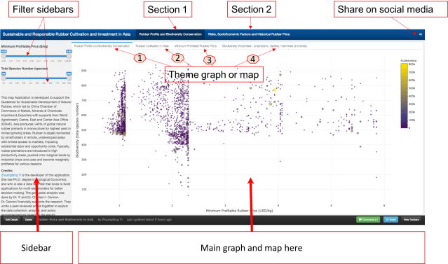
The main user interface looks like the graph (Fig 2). There are 4 theme graphs and maps.

主用户界面看起来像图表(见图2)。有4个主题图和地图。
p1_section intro

Fig. 2. The main user interface of the online map tool.

图2:在线地图工具的主要用户界面。包括上图可见的“简介”,“第一部分”,“第二部分”,和“社交媒体分享”。

. Section 1 第一部分内容

This graph tells the correlation between “Minimum Profitable Rubber (USD/kg)” (the x-axis of the graph, and “Biodiversity (total species number)” in 2736 county that planted natural rubber trees in eight countries in tropical Asia.  There are 4312 counties in total, and in this map tool, we only present county that has the natural rubber cultivated.

这张图显示了亚洲热带地区八个国家种植天然橡胶树的2736个县的最低橡胶成本(美元/千克)(图的X轴)和生物多样性(总种数)之间的关系。共有4312个县,在这个地图工具中,我们只提供了有天然橡胶种植的2736县相关的内容。

p1_section intro_high

Fig. 3. How to read and use the data from the first graph. Each dot/circle represents a county, the color, and size of it indicates the area of natural rubber are planted. When you move your mouse closer to the dot, you will see “(2.34, 552) 400000 ha @ Xishuangbanna, China”, 2.34 is the minimum profitable rubber price (USD/kg), 552 is the total wildlife species including amphibians, reptiles, mammals, and birds.  “400000 ha” is the total area of planted natural rubber plantation from satellite images between 2010 and 2013. “@ Xishuangbanna, China” is the geolocation of the county. 

图3:如何阅读和使用第一个图中的数据。每个圆点/圆代表一个县,其颜色和大小表示天然橡胶种植面积。当你移动你的鼠标时,比如你会看到“(2.34,552)400000公顷的“西双版纳、中国”,2.34是最低盈利(成本)橡胶价格(美元/公斤),552是总的野生物种,包括两栖动物、爬行动物、哺乳动物和鸟类。“400000公顷”是2010~2013年间卫星影像种植天然橡胶种植园的总面积。“西双版纳、中国”是本县的地理位置。

Don’t be shy, please go ahead and play with the full-screen map here. The minimum profitable rubber price is the market price for national standard dry rubber products that would help you to start makes profits. For example, if the market price of natural rubber is 2.0 USD/kg in the county your rubber plantation located, but your minimum profitable rubber price is 2.5 USD/kg means you will lose money by just producing rubber products. However, if your minimum profitable rubber price is 1.5 USD/kg means you will still make about 0.5 USD/kg profit from your plantation.

请不要拘谨,可以在这里浏览全屏地图。最低橡胶成本换算成国家标准的干橡胶产品的市场价格,这将有助于你理解您所属橡胶园的盈利起始点。例如,如果你所在的橡胶种植区的天然橡胶市场价格是2美元/公斤,但你的最低成本橡胶价格是2.5美元/公斤,意味着你生产橡胶产品就会亏本。然而,如果你的最低成本的橡胶价格是1.5美元/公斤意味着你的种植园仍然会赚约0.5美元/公斤的利润。

The county that has a lower minimum profitable price for natural rubber is generally going to make better rubber profit in the global natural rubber market. However, as scientists behind this research, we hope that when you rush to invest and plant rubber in a certain county, please also think about other risks, e.g. biodiversity loss, topographic, tropical storm, frost as well as drought risks. They are going to be shown later in this demonstration. 

那些天然橡胶经营平均成本最低的县,在全球天然橡胶市场上将获得较好的橡胶利润。然而,作为这项研究背后的科学家,我们希望,当你在某个县匆忙投资成本较低的县市种植橡胶时,也要考虑其他风险,例如生物多样性丧失、地形、热带风暴、霜冻以及干旱风险。这些将被显示在这个演示之后。

p2_section intro_high.gif

Fig. 4.  The first map is the “Rubber Cultivation Area”, which shows the each county that has rubber trees from low to high in colors from yellow to red. The second map “Minimum Profitable Rubber Price”(USD/kg), again the higher the minimum profitable price is the fewer rubber profits that farmers and investors are going to receive. The third map is ” Biodiversity (Amphibians, Reptiles, Mammals, and Birds)”,  data was aggregated from IUCN-Redlist and BirdLife International.

图4:第一张地图是“橡胶种植区”,它显示了每个县的橡胶树种植数量从低到高的颜色,即从黄色到红色。第二张图“最低成本”(美元/千克),橡胶的平均成本越高,橡胶园的经营者就会获得更少的利润。第三地图是“生物多样性(两栖动物、爬行动物、哺乳动物和鸟类)”,数据来自世界自然保护联盟红色名录IUCN-Redlist和国际鸟盟聚集BirdLife International

. Section 2 第二部分

We also demonstrated different types of risks that investors and smallholder farmers would face when they invest and plant rubber trees. Rubber tree doesn’t produce rubber latex before 7 years old, and the tree owners won’t make any profit until the tree is around 10 years old in general. In this section, we presented “Topographic Risk”, ” Tropical Storm”, “Drought Risk”,  and “Frost Risk”.

我们还展示了投资者和小农投资种植橡胶树时会面临的不同风险类型。橡胶树种植前7年在橡胶树不生产任何胶乳的情况下是没有任何盈利的,甚至橡胶园的经营者一般在橡胶树种下10年之前都不会获利。该部分中,我们提出了“地形风险”、“热带风暴”、“干旱风险”和“霜冻风险”。

p3_section intro_high.gif

Fig. 5. Section 2 ” Risks, SocioEconomic Factors and Historical Rubber Price” has seven different theme maps and interactive graphs. They are “Topographic Risk”, ” Tropical Storm”, “Drought Risk”,  and “Frost Risk”, “Average Natural Rubber Yield (kg/ha.year)”, “Minimum Wage for the 8 Countries (USD/day)”, and ” 10 years Rubber price”.

图5:第2节“风险、社会经济因素和橡胶价格历史”有七种不同的主题地图和互动图表。它们是“地形风险”、“热带风暴”、“干旱风险”、“霜冻风险”、“平均天然橡胶产量(千克/公顷)”、“8个国家的最低工资(美元/天)”和“10年橡胶价格”。

If you are interested in how the risk theme maps were produced, Dr. Antje Ahrends and her other coauthors have a peer-reviewed article published in Global Environmental Change in 2015.  “Average Natural Rubber Yield (kg/ha.year)” and “Minimum Wage for the 8 Countries (USD/day)” dataset was obtained from  International Labour Organization (ILO, 2014)  and FAO.” 10 years Rubber price” was scraped from  IndexMudi Natural Rubber Price.

这个互动地图集中展示的所有内容都是有科学依据的。如果你想知道风险专题地图是如何编制的,Antje Ahrends博士和其他合作者有一篇同行评审的论文,发表在2015年的国际期刊《全球环境变化》。“平均天然橡胶产量(公斤/公顷/年)”和“8国家最低工资(元/天)”的数据来自国际劳工组织(ILO,2014年)和联合国粮农组织。“10年橡胶价格”来自于天然橡胶的价格indexmudi。

Dr. Chuck Cannon and I are wrapping up a peer-reviewed journal article to explain the data collection, analysis, and policy recommendations based on the results, and we will share the link to the article once it’s available. Dr. Xu Jianchu and Su Yufang have shaped and provided guidance to shape the online map tool development. We could not gather the datasets and put insights to see how we could cultivate, manage, and invest in natural rubber responsibly without other scientists and researchers study and contribute to field for years. We appreciated Wildlife Conservation Society, many other NGOs and national department of rubber research in Thailand and Cambodia for their supports during our field investigation in 2015 and 2016.

Chuck Cannon博士和我正在撰写一篇同行评议的科研期刊文章,用来解释该地图集生成的数据收集、分析等等,还包括了政策建议。文章一旦发表,我们会和您分享文章的链接。许建初博士和苏宇芳博士为在线地图集的开发提供了非常宝贵的意见和建议。我们无法收集数据集、并在没有其他科学家和研究人员的研究和贡献的情况下深入了解如何才能负责任地种植、管理和投资天然橡胶。我们感谢野生动物保护协会和许多其他非政府组织,以及泰国和柬埔寨国家橡胶研究院在2015和2016年的实地调查中给予的支持。

We have two country reports for natural rubber in Thailand, and natural rubber and land conflict in Cambodia, a report support this online map tool is finalizing and we will share the link soon when it’s ready.

我们有两份关于泰国天然橡胶柬埔寨天然橡胶和土地利用冲突的国家报告,一份支持这一在线地图工具的报告正在定稿,我们将很快分享这一链接。

~~~~~~~~~~~~~~~~~~~~~~~~~~~~~~~~~~~~~~~~~~~~~~~~~~~~~~~~~~~~~

Technical sides 技术层面

The research and analysis were done in R, and you could find my code here.

The visualization is purely coded in R too, isn’t R is such an awesome language? You could see my code for the visualization here.

研究和分析是利用R完成的,您可以在这里找到我的代码

可视化地图也是在R中利用纯编码编写的,难道R不是一个很棒的语言吗?你可以在这里看到我的可视化代码。

To render geojson format of multi-polygon, you should use:

library(rmapshaper)
county_json_simplified <- ms_simplify(<your geojson file>)

My original geojson for 4000+ county weights about 100M but this code have help to reduce it to 5M, and it renders much faster on Rpubs.com.

我原来的GeoJSON 4000 +县级文件大小约100兆,但是这行代码有效的使文件降低到5兆。

I learnt a lot from this blog on manipulating geojson with R and another blog on using flexdashboard in R for visualization. Having an open source and general support from R users are great.

我从这个使用R的博客上和另一个博客的可视化学到了很多东西。开放性平台和R给予大家更大的创作空间。

PV Solar Installation in US: who has installed solar panel and who will be the next?

Project idea

Photovoltaic (PV) solar panels, which convert solar energy into electricity, are one of the most attractive options for the homeowners. Studies have shown that by 2015, there are about 4.8million homeowners had installed solar panels in the United States of America. Meanwhile, the solar energy market continues growing rapidly. Indeed, the estimated cost and potential saving of solar is the most concerned question. However, there is a tremendous commercial potential for the solar energy business, and visualizing the long term tendency of the market is vital for the solar energy companies’ survival in the market . The visualization process could be realized by examining the following aspects:

  1. Who has installed PV panels, and what are the characteristics of the household, e.g. what’s the age, household income, education level, current utility rate, race, home location, current PV resource, existing incentive and tax credits for those that have installed PV panels?
  2. What does the pattern of solar panel installation looks like across the nation, and at what rate? Which household is the most likely to install solar panels in the future?

The expected primary output from this proposal is a web map application . It will contain two major functions. The first is the cost and returned benefit for the households according to their home geolocation. The second is interactive maps for the companies of the geolocations of their future customers and the growth trends.

Initial outputs


The cost and payback period for the PV solar installation: Why not go solar!

NetCost

Incentive programs and tax credits bring down the cost of solar panel installation. This is the average costs for each state.

Monthly Saving

Going solar would save homeowners’ spending on the electricity bill.

Payback Years

Payback years vary from state to state, depending on incentives and costs. High cost does not necessarily mean a longer payback period because it also depends on the state’s current electricity rate and state subsidy/incentive schemes. The higher the current electricity rate, the sooner you would recoup the costs of solar panel installation. The higher the incentives from the state, the sooner you will recoup the installation cost.

How many PV panels have been installed and where?

Number of Solar Installation

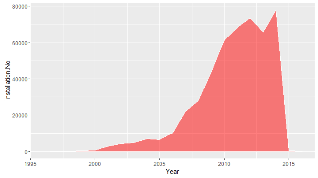
The number of solar panels installed in the states that have been registered on NREL’s Open PV Project. There were about 500,000 installations I was able to collect from the Open PV Project. It’s zip-code-based data, so I’ve been able to merge it to the “zip code” package on R. My R codes file is added here at my GitHub project.

Other statistical facts : American homeowners who installed solar panels generally has $25,301.5higher household income compare to the national household income. Their home located in places that have higher electricity rate, about 4 cents/kW greater than the national average, and they are also having higher solar energy resource, about 1.42 kW/m2 higher than the national average.

Two interactive maps were produced in RStudio with “leaflet”

Solar Installation_screen shot1

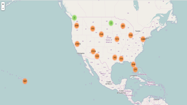
An overview of the solar panel installation in the United States.

Solar Installation_screen shot2

Residents on the West Coast have installed about 32,000 solar panels from the data registered on the Open PV Project, and most of them were installed by residents in California. When zoomed in closely, one could easily browse through the details of the installation locations around San Francisco.

Solar Installation_screen shot3

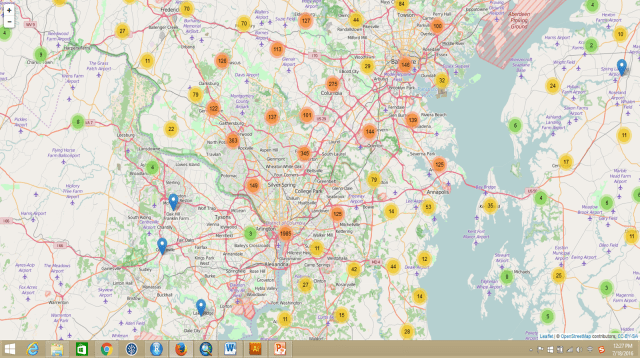
Another good location would be The District of Columbia (Washington D.C.) area. The East Coast has less solar energy resource (kW/m2) compared to the West Coast, especially California. However, the solar panel installations of homeowners around DC area are very high too. From maps above, we know that because the cost of installation is much lower, and the payback period is much faster compared to other parts of the country. It would be fascinating to dig out more information/factors behind their installation motivation. We could zoom in too much more detailed locations for each installation on this interactive map.

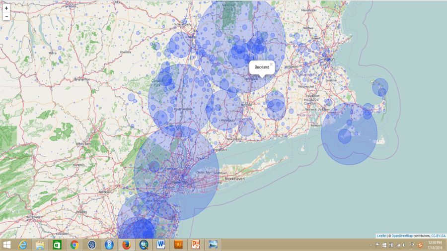
However, some areas, like DC and San Francisco, have a much larger population compared to other parts of US, which means there are going to be much more installations. An installation rate per 10,000 people would be much more appropriate. Therefore, I produced another interactive map with the installation rate per 10,000 people, the bigger the size of the circle is the higher rate of the installation.

Solar Installation_screen shot4

The largest installation rate in the country is in the city of Ladera Ranch, located in South Orange County, California. Though, the reason behind it is not clear and more analysis is needed.

Solar Installation_screen shot5

Buckland, MA has the highest installation on the East Coast. I can’t explain what the motivation behind it yet either. Further analysis of the household characteristics would be helpful. These two interactive maps were uploaded tomy GitHub repository, where you will be able to see the R code I wrote to process the data as well.

Public Data Sources

To answer these two questions, datasets of 1670M (1.67G) were downloaded and scraped from multiple sources:
(1). Electricity rate by zip codes;

(2). A 10km resolution of solar energy resources map, in ESRI shapefile, was downloaded the National Renewable Energy Laboratory (NREL); It was later extracted by zipcode polygon downloaded from ESRI ArcGIS online.

(3). Current solar panel installation data was scraped from the website of open PV website, a collection of installations by zip code. It requires registration to be able to access the data. It is part of NREL. The dataset includes the zip code of the installation, the cost, the size of the installation and the state of each location.

(4). Household income, education, the population of each zip code was obtained from US census.

(5). The average cost of the solar installation for each state was scraped from the website: Current cost of solar panels and Why Solar Energy? More of datasets for this proposal will be downloaded from the Department of Energy on GitHub via API.

Note: I cannot guarantee the accuracy of the analysis. My results are based on two days of data mining, wrangling, and analysis. The quality of the analysis is highly depended on the quality of the data and on how I understood the datasets in such limited time. A further validation of the analysis and datasets is needed.

For further contact the author, please find me on https://geoyi.org; or email me:geospatialanalystyi@gmail.com.

My web map application is online

Hi friends,

I’ve been working on a web application for Chinese Ministry of Commerce on rubber cultivation and risks will be out soon, and I just wanna share with you the simplified version web map API here. I only have layers here, though, more to come.

Screen shot for web map application

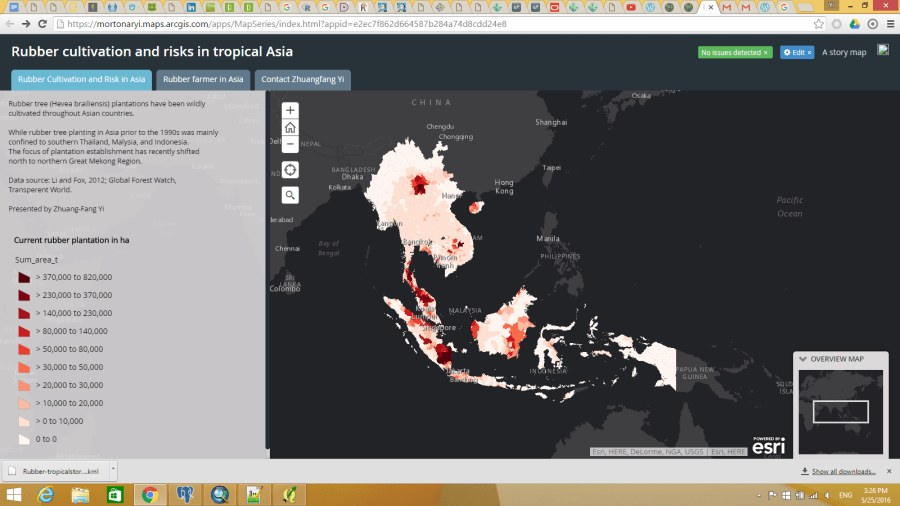
Web map application by Zhuangfang Yi: Current rubber cultivation area (ha) in tropical Asia

This web map API aims to tell the investors that rubber cultivation is not just about clearing the land/forests, plant trees and then you could wait for tapping the tree and sell the latex. There are way more risks for the planting/cultivate rubber trees, including several natural disasters, cultural and economic conflicts between the foreign investors and host countries.

We also found the minimum price for rubber latex for livelihood sustainability is as high as 3USD/kg. I define the  minimum price is the price that an investor/household could cover the costs of establishing and managing their rubber plantations. While the actual rubber price is lower than the minimum price, there is no profit for having the rubber plantations. The minimum price for running a rubber plantation varies from country to country. I ran the analysis through 8 countries in Asia: China, Laos, Myanmar, Cambodia, Vietnam, Malaysia and Indonesia. The minimum price depends on the minimum wage, labour availability, costs of the plantation establishments and management, average rubber latex productivity throughout the life span of rubber trees. The cut-off price ranges from 1.2USD/kg to 3.6USD/kg.

We could make an example that if rubber price is 2USD/kg now in the market, the country whose cutoff price for rubber is 3USD/kg won’t make any profit, but the investors in the country might lose at least 1USD/kg for selling every kg of rubber latex.


Web GIS is the next big thing in geospatial analysis and why

I bet a lot of you know about google map, and use it very frequently for daily life. Google map is online mapping service that do the calculation, analysis mainly through geocoding. Geocoding is an algorithm that based on location and zip code.  Google provides the awesome products and mapping services like satellite imagery (base map), google earth, street map and 360 panoramic street view, google traffic. You might have noticed that recently google just add biking and flight functions to Google map, and now you could easily estimate the traffic time by bike and flight besides walking, public transportation and driving.  It’s so shame that google products are blocked in China, including google map. Anyway, the only motivation get me writing more blogs about geo-sicence stuffs just because my ideal job for my future career is become a geospatial analyst and cartographer. Google map we’re talking about here, it is already a final product of geospatial analysis. But as a geospatial analyst or GIS specialist, we are looking for pulling different spatial/non-spatial data for another exciting analysis everyday, and finally get people to use and benefit from it.

564B363F-A18A-4555-A292-376C27FD1017

(Ready to use provide by ESRI web map)

I signed up a free online course, on ArcGIS Online, with ESRI three weeks ago, with other 5000 students from different corners of the world. It’s really fascinating to see other 5000+ students, as dots,  popup on a map. How advance the geospatial analysis, computing, and open source spatial datasets have been developed in the states are blowing my mind every day, since I have devoted myself in GIS (Geographic Information system) studying. It’s really a shock, and feel like I am really proud of owning a new bicycle and find all my peers are driving rockets around already. Learning about it and being part of it is just so exciting.
Web maps have been existed for a decade. However, we are far behind back to China. A lot of my colleagues and friends are using ArcGIS 9.3, and in the states that 10.3 has been released for a while ago. It can’t be said that there are 10 generations gap between this two version, but it’s quite a big gap. The gap between two countries are not just the tool, analysis skill but it’s also the spatial datasets. Spatial datasets are not widely available in China, so we have to looking for a cooperation or buy the data from other research institutes and state departments, who are supposed to provide free data for research purpose. However, I believe the picture is changing very soon, cause there are huge needs for spatial analysis and planning in China, and it’s same to other developing countries.
The advantage of web GIS and mapping I could think about, would be:
  1. Sharing and presenting spatial analysis products could get immediate feedback from users, this is first thing make web GIS a big thing in the future. It’s all about how users feel and like it. From user/costumers preference on different function of the maps, the dives they use for the map, the engineer and analyst behind the service could improve the products largely;
  2. Much easier to share data and results,  and as a geospatial analyst, who could also access, analyze and edit the geo datasets whenever and wherever  they have internet;
  3. More and more open source spatial data are available online, and it’s became very powerful and easy to use online GIS analyzing tools, e.g. ArcGIS Online, GeoNetwork for the analysis;
  4. Online mapping tools could be used to make much appealing maps. If you are a heavy user of ArcGIS desktop, you would know how painful when your calculation could not be done because of some minor issues, and how much space the ArcGIS desktop takes up your PC and lap top. If you’re not have a cartography background or not that familiar with map displaying, your map products could end up looking like an disaster, which is my own experiences;
  5. Geospatial community is more like a open and sharing community, and there are already lot of geo experts engaged in providing free open sources and also expertise in a humanitarian crisis. For example, there are a huge group of volunteers from around the world rapidly digitized satellite images, maps and data to support humanitarian organizations got to rescue local people in the 2015 earthquake in Nepal.
  6. Everyone could contribute to Web GIS and mapping service. You could sign up Open Street Map for digitizing your community, it is being heavily used in Nepal earthquake. Your feedback for any mapping APPs would help to improve the service. Flickr pictures link to google map, or other online map services.  Drone using is new thing and also contributing hugely to wildlife population monitoring, land-use changes, and I am not talking about someone who use drone to stalk other people here.
There are just my thoughts. I might be wrong in some parts, and if you have any advice on revising the content, or editing the language please let me know.
job accessible in newyork