
Bike sharing system is a convenient and clean way to get around the cities through obtaining membership, rental and bike return. It’s getting popular among high populated cities globally.
现在很多城市都已经开始使用自行车租用系统。自行车租用是通过购买会员,租车和还车的一个系统。

(this picture is from http://kaggle.com)
(图片来源于http://kaggle.com)
While I was in Chicago for a business trip, my favourite activity was riding the rental bike around the Lake Michigan. In a bright autumn afternoon with few cloud and the air cools down, it’s definitely a perfect time to rent a bike to explore an unknown city as a tourist. However, it’s quite frustrated while millions of tourists are renting the bikes. It’s unpleasant if there are no bike left and also too many bikers sharing a tiny bike lane. To find a nice fall afternoon and not many people on the road make a perfect sense while you’re a tourist in an exciting city you wanna explore.
我在芝加哥出差的时候最难忘的经历便是骑着自己租用的自行车环着密歇根湖环行。如果在午后空气凉爽的秋季骑上自行车到处逛逛你没有住过的城市,该是多么美好的一件事情啊。但是对于一个普通的只想探索一个未知城市的旅行者来说,过多的自行车骑客拥挤在一条小小的自行车道上也还是蛮郁闷的。所以对于游客来说找一个秋季凉爽的天气,没有多少其他行人出去骑车体验未知的城市那是多美好,对吧!
As a city bike sharing manager, you wanna share the as many bikes as with potential riders, and I am sure you will have such concerns:
但是对于一个自行车租用系统的管理者来说,他担忧的内容又完全和游客考虑的内容是不一样的。对于管理者他可能会有以下的顾虑:
- How many bikes are actually needed in the city bike sharing system? 我们的城市自行车租用系统到底需要多少自行车?
- If the bike demand varies every day according to the temp, weather, holiday, and humidity?每一天自行车的租用情况随着气温,天气,假期和空气湿度等等的变化是如何变化的?
It will be most cost-efficient that the city won’t provide too many bikes and it’s important not to run short.所以对于一个管理者来说,用经济的自行车租用数量最好的服务市民才是最重要的。
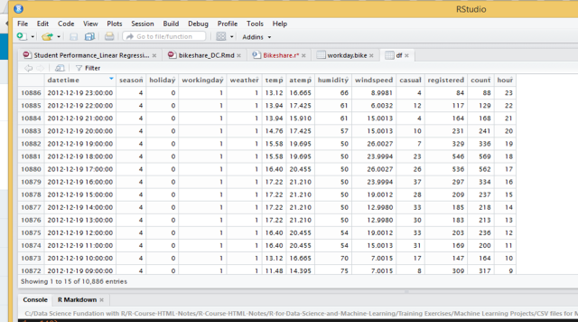
Here, I got the data from http://kaggle.com, it about 11,000 records in the dataset. This dataset was provided by Hadi Fanaee Tork using data from Capital Bikeshare. Capital Bikeshare is a bike sharing system in Washington DC that aims to rent a bike for people who are going to Metro, to work, run errands. It has more than 3000 bikes in the system for over 350 stations across Washington DC, Arlington and Alexandria, VA and Montgomery County, MD and it could be returned to any station near your destination. I have not used bikes in DC yet and might be worth to try, it’s free for first 30mins.
这个数据来源是http://kaggle.com,一共有两年11,000个自行车使用情况的记录。原始数据由华府(美国首都华盛顿特区)的华府自行车共享的Hadi Fanaee Tork提供。华府自行车共享系统是针对居民出行的需要(去地铁,去工作,购物)设置的。整个系统有350多个租用站3000多辆自行车,分别分布于华府,佛吉尼亚州的阿灵顿,压力山大港,以及马里兰州的蒙哥马利县各处。 虽然住在华府附近已久但是我自己还没有使用过这个系统里的自行车,听说最开始的30分钟是免费的—值得一试。

Some result from the data analysis
初始数据分析结果

(1-Spring; 2-Summer, 3-Fall; and 4-Winter)
(图中1是指春季,2是指夏季,3是秋季,4是冬季)
From the graph, we could tell that more people are using bikes during the fall, and least people are biking around during the spring time.从上图可以看出来秋季是人们最喜欢骑自行车但是春季是最不喜欢骑自行车的季节。

Through the year, bike demand starts to climb after Apri and decline after Oct. The demand pick is around Sep at least from 2 years data records.
从一整年的情况来看人们最喜欢骑自行车的月份开始于4月然后到10月份就开始下降了。需求量的最高峰出现在9月份。
When I replot the data to 24 hours for working days, from the midnight to 23:00, the pattern of bike demand could be seen as 1) while the temperature rises more people are on bike; 2) there are two peaks of bike demands in a work day, which is morning time around 8am and afternoon around 18am; 3) People like to use bike during the lunch time while the temperature is warmer than 20 degrees.
如果把自行车的需求量按照一天24小时来作图,这个提取的数据是工作日的自行车需求量。那么从下图我们可以分析出一些规律:1)气温升高的时候骑自行车的人也变多了;2)在工作日的24小时里头早上和下午出现两个使用自行车的高峰期,不高气温高低;3)在午餐休憩期间也有不少人使用自行车呢,特别是温度高于20度之后使用的人似乎更多。

However, the bike demand looks a bit different when it was a holiday. The maximum of bike demand was not that high compares to the working days, which means residents in DC area are using bikes. The demand for the holiday is more spread out than work days, and it slowly starts after 8 am when the temperature is pleasant, and the demand peak appears around 13:00 to 17:00.
但是在假期的时候自行车的使用情况和工作日还是有所不同的。至少从需求量来看假期的自行车需求在最高峰的时候没有工作日多,但是高峰期更宽时间跨度更长。这个高峰期主要集中出现在下午1点到5点之间。

From the above graphs, you might find we only have dug out the bike demands, which is label as “count” in the dataset, together with temperature (mainly). If we wanna make a prediction of how many bikes we actually need for each day, and just imagine that any condition you don’t wanna ride a bike in DC. If I only speak for myself, I don’t wanna ride a bike: 1). When it’s too cold out there (Oops, topical people); 2) too humid; 3) too windy; 4) it’s rainy hard; 5) too many people out there riding bikes.
上面几个图中我们只是观察了自行车需求量和气温的关系。但是对于现实情况来看自行车需求量其实不只是和气温有关系。从我个人角度来讲,以下情况下我就不可能在外头骑自行车:1)外面太冷 (热带人们怕冷);2)外头湿度太大,黏答答的有没有?!;3)风太大(毕竟人比较瘦,嘻嘻);4)雨下得太大了;5)其实汽车人太多我也不喜欢哎~
To make a prediction like a bikshare system manager, we need to know the correlation of each pair of variables, which the pair between each of humidity, weather, workingday, windspeed, hour, holiday and so on. Therefore, I produced a graph to pair out the correlation for each pair of variables. The blue colour represents positive correlation, and red colours mean negative correlation. For example, looking at the column of ‘count'(it’s the bike demand I mentioned above), it has positive correlation with temperature (‘temp’) in the graph, which means when temperature goes up people like to ride bike, but it has negative correlation with humidity (‘humidity in the graph’), which indicates people would not like to ride a bike during a high humidity time. Note: this is a linear regression, which means I just assume each pair of variables is linearly correlated, which could not actually reflect the reality sometimes. For example, I could not bike outside while it’s too hot, but the regression tells that people would love to bike even more while it’s actually hot (with positive correlation).
那么要像一个自行车租用管理者一样思考,我们就要知道我提的以上的变量彼此之间怎么互相影响,对吧。所以我又做了一个图,对比两两变量之间的关系是怎么样的。下图的蓝色代表的是正相关,红色系表示的是负相关。我们就可以看,自行车的需求量(图中的“count”)那一栏对到humidity(空气湿度)的饼图就发现他们其实就是负相关,意思就是如果外面湿度太大在外面汽车的人就越少,反过来说就是这时候自行车的需求量就小了。那对着看count 和temp(温度)的关系就发现他们是正相关,正相关的意思就是温度越高我就越爱在外头骑自行车,所以对于一个城市来说自行车的需求量就高了。当然我们这里做的是线性回归。线性回归的意思就是,我们都是直来直去的关系不拐弯抹角。但是其实这不能反映现实情况,比如温度直线上升我怎么会喜欢在外头骑自行车呢,对吧?!但是可能华府它气温就不可能太高,或者说气温高的天数太少了从真个数据(样本)来看对整体不构成影响。

I ran the linear regression between bike demands and the variables above and had this blowing regression. It will be able to help us to predict how many bikes we actually need in The Capital Bikeshare system each day, according to the weather, holiday, and temperature, etc. As a tourist, you could also predict if you wanna go out today according to the weather prediction and rough prediction of how many bikes are going to be around in the city.
从下头的多元线性回归中,我们便可以依据每天天气情况,是否是假期等等因素来考虑每天自行车的需求量,这也就是一个自行车租用系统管理者关心的。但是反过来,作为游客我们也可以依照天气预报大概估算一下今天在街上租用自行车的人大概有多少人,如果喜欢热闹就选在人相对多的时候出门如果不喜欢热闹怕吵那就在人少的时候出门。

At this point we could make a prediction/assumption: Today, it’s fall now, and holiday; the weather is clear, few clouds; temp is 30, but air temp is about 34; humidity is about 70%; weed seed is about 2, and it’s close to 16:00 pm now. So we could predict how many bikes are needed for the particular hour, day and weather.
The answer is 781 bikes.
My R codes could be found here: http://rpubs.com/Geoyi/BikeshareDC_LM.
到这个点上,我们就可以大概预测:今天是秋天里气候凉爽,少云;气温在30度左右,湿度为70%,风速不大大概在2左右,然后现在快要下午四点了,而且还是不用工作的假期。那么从上么的公式我们就可以大概预测,今天在周围活动的自行车大概是781辆。
我的数据分析R程序代码在这里:http://rpubs.com/Geoyi/BikeshareDC_LM。
Statistics is quite useful, isn’t it?!
统计是不是很有用呢?!

Thank you for sharing Yi, I appreciated the “questions-oriented” approach, which is imo the best approach to gain useful insights from data.
I would substitute the first plot (boxplots by season) with a barplot representing the sum of count variable by season.
to understand the rational just look at the following example (poor code, I know):
a <- c(2,7,9,2,3,1,1)
b <- c(1,2,2,1,2,2,1,2,3,4,2,3,1,1)
a_frame <- data.frame(count= a, type = "a")
b_frame <- data.frame(count= b, type = "b")
pop <- rbind(a_frame,b_frame)
ggplot(pop,aes(x=type,y = count))+
geom_boxplot()
sum(a) #25
sum(b) #27
here the boxplot would let you imagine the sum of 'a' being greater than the sum of 'b', while the reality is the opposite. for your convenience I put down some code to produce a bar plot with bike sharing data you are using: https://gist.github.com/AndreaCirilloAC/ef26e3e8a43c0f6aae80aa7630fd4297
I really hope the explanation was clear enough. thank you for sharing.
LikeLiked by 1 person
Hi Andrea, I like the barplot you code in GitHub very much. It carries more information than my boxplot definitely. I used boxplot just for a more variability in plotting data I think. Thanks for sharing your insight ^^.
LikeLiked by 1 person