This is Chinese version, if you have not seen the blog (in English) yet, go here: https://developmentseed.org/blog/2018/01/11/label-maker/
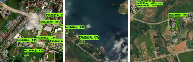
Label Maker is a python library to help in extracting insight from satellite imagery. Label Maker creates machine-learning-ready training data for most popular ML frameworks, including Keras, TensorFlow, and MXNet. It pulls data from OpenStreetMap and combines that with imagery sources like Mapbox or Digital Globe to create a single file for use in training machine learning algorithms.
# the data, shuffled and split between train and test sets
npz = np.load('data.npz')
x_train = npz['x_train']
y_train = npz['y_train']
x_test = npz['x_test']
y_test = npz['y_test']

# define your model here, example usage in Keras
model = Sequential()
# ...
model.compile(...)

# train
model.fit(x_train, y_train, batch_size=16, epochs=50)
model.evaluate(x_test, y_test, batch_size=16)
Please go ahead and play with the full-screen map here.
This map Application is developed to support the Guidelines for Sustainable Development of Natural Rubber, which led by China Chamber of Commerce of Metals, Minerals & Chemicals Importers & Exporters with supports from World Agroforestry Centre, East and Center Asia Office (ICRAF). Asia produces >90% of global natural rubber primarily in monoculture for highest yield in limited growing areas. Rubber is largely harvested by smallholders in remote, undeveloped areas with limited access to markets, imposing substantial labor and opportunity costs. Typically, rubber plantations are introduced in high productivity areas, pushed onto marginal lands by industrial crops and uses and become marginally profitable for various reasons.
Fig. 1. Rubber plantations in tropical Asia. It brings good fortune for millions of smallholder rubber farmers, but it also causes negative ecological and environmental damages.
图1:亚洲热带橡胶种植园。它给数以万计的小橡胶农民带来收入,但它也造成了负面的生态和环境的破坏。
The online map tool is developed for smallholder rubber farmers, foreign and domestic natural rubber investors as well as different level of governments.
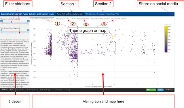
The online map tool entitled “Sustainable and Responsible Rubber Cultivation and Investment in Asia”, and it includes two main sections: “Rubber Profits and Biodiversity Conservation” and “Risks, SocioEconomic Factors, and Historical Rubber Price”.
This graph tells the correlation between “Minimum Profitable Rubber (USD/kg)” (the x-axis of the graph, and “Biodiversity (total species number)” in 2736 county that planted natural rubber trees in eight countries in tropical Asia. There are 4312 counties in total, and in this map tool, we only present county that has the natural rubber cultivated.
Fig. 3. How to read and use the data from the first graph. Each dot/circle represents a county, the color, and size of it indicates the area of natural rubber are planted. When you move your mouse closer to the dot, you will see “(2.34, 552) 400000 ha @ Xishuangbanna, China”, 2.34 is the minimum profitable rubber price (USD/kg), 552 is the total wildlife species including amphibians, reptiles, mammals, and birds. “400000 ha” is the total area of planted natural rubber plantation from satellite images between 2010 and 2013. “@ Xishuangbanna, China” is the geolocation of the county.
Don’t be shy, please go ahead and play with the full-screen map here. The minimum profitable rubber price is the market price for national standard dry rubber products that would help you to start makes profits. For example, if the market price of natural rubber is 2.0 USD/kg in the county your rubber plantation located, but your minimum profitable rubber price is 2.5 USD/kg means you will lose money by just producing rubber products. However, if your minimum profitable rubber price is 1.5 USD/kg means you will still make about 0.5 USD/kg profit from your plantation.
The county that has a lower minimum profitable price for natural rubber is generally going to make better rubber profit in the global natural rubber market. However, as scientists behind this research, we hope that when you rush to invest and plant rubber in a certain county, please also think about other risks, e.g. biodiversity loss, topographic, tropical storm, frost as well as drought risks. They are going to be shown later in this demonstration.
Fig. 4. The first map is the “Rubber Cultivation Area”, which shows the each county that has rubber trees from low to high in colors from yellow to red. The second map “Minimum Profitable Rubber Price”(USD/kg), again the higher the minimum profitable price is the fewer rubber profits that farmers and investors are going to receive. The third map is ” Biodiversity (Amphibians, Reptiles, Mammals, and Birds)”, data was aggregated from IUCN-Redlist and BirdLife International.
We also demonstrated different types of risks that investors and smallholder farmers would face when they invest and plant rubber trees. Rubber tree doesn’t produce rubber latex before 7 years old, and the tree owners won’t make any profit until the tree is around 10 years old in general. In this section, we presented “Topographic Risk”, ” Tropical Storm”, “Drought Risk”, and “Frost Risk”.
Fig. 5. Section 2 ” Risks, SocioEconomic Factors and Historical Rubber Price” has seven different theme maps and interactive graphs. They are “Topographic Risk”, ” Tropical Storm”, “Drought Risk”, and “Frost Risk”, “Average Natural Rubber Yield (kg/ha.year)”, “Minimum Wage for the 8 Countries (USD/day)”, and ” 10 years Rubber price”.
Dr. Chuck Cannon and I are wrapping up a peer-reviewed journal article to explain the data collection, analysis, and policy recommendations based on the results, and we will share the link to the article once it’s available. Dr. Xu Jianchu and Su Yufang have shaped and provided guidance to shape the online map tool development. We could not gather the datasets and put insights to see how we could cultivate, manage, and invest in natural rubber responsibly without other scientists and researchers study and contribute to field for years. We appreciated Wildlife Conservation Society, many other NGOs and national department of rubber research in Thailand and Cambodia for their supports during our field investigation in 2015 and 2016.
It doesn’t matter which part of the world you are living now, very diverse tree species are planted around the urban area we live. Trees in the urban areas have many functions, for example, trees provide habitats for wildlife, clean air and water, provide significant health and social benefits, and also improve property value too. Wake up in a beautiful morning that birds are singing outside your apartment because you have many beautiful trees grow outside of your space. How awesome is that!
However, tree planting, survey, and species identification require an enormous amount of work that literally took generations and years of inputs and care. What if we could identify tree species from satellite imagery, how much faster and how well we could get tree species identified and also tell their geolocations as well.
A city has its own tree selection and planting plan, but homeowners have their own tree preference, which the identification work a bit complicated, though.
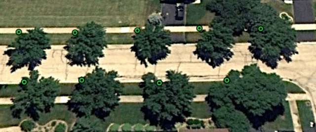
(Photo from Google Earth Pro June 2010 in Chicago area)
It’s hard to tell now how many tree species are planted in above image. But we could (zoom in and) tell these trees actually have a slightly different shape of tree crown, color, and texture. From here I only need to have a valid dataset basically tell me what tree I am looking at now, which is a tree survey and trees geolocation records from the city. I will be able to teach a computer to select similar features for the species I’m interested in identifying.
These are Green Ash trees (I marked as green dots here).
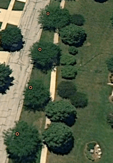
These are Littleleaf Linden, they are marked as orange dots.
Let me run a Caffe deep learning model (it’s one of the neural networks and also known as artificial intelligence model) for an image classification on these two species, and see if the computer could separate these two species from my training and test datasets.
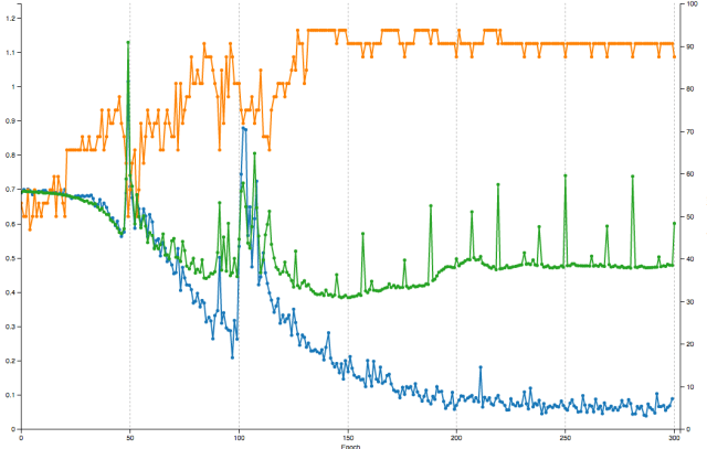
Great news that the model could actually tell the differences between these two species. I run the model for 300 epochs (runs) from learning rate 0.01 to 0.001 on about 200 images for two species. 75% went to train the model and 25% for testing. The result is not bad that we have around 90% of accuracy (orange line) and less than 0.1 loss on the training dataset.
I threw a random test image to the model (a green ash screenshot in this case) and it tells the result.
I will be working on identifying other 20 trees species and their geolocations next time.
Let’s get some answer what trees are planted in Chicago area and how it related to the property value (an interesting question to ask), and also what ecological benefits and functions these tree are providing (leave this to urban ecologist if my cloud computer could identify the species)? Check my future work ;-).